Michael McCracken on OS X UI
Michael McCracken has two recent posts on OS X UI: Hypertext links as Native UI and The Mac UI Question.
Michael McCracken has two recent posts on OS X UI: Hypertext links as Native UI and The Mac UI Question.
Sven-S. Porst: Source Lists: “It’s astonishing to see how differently source lists can behave. Basically they are just lists of items which usually have icons. But apart from the icons all other aspects of the lists can differ.”
(Via Michael Tsai.)
Other developers write about walking the user interface line—trying to be consistent but also having to create custom widgets to stay modern.
Michael Dupuis: “Sure there are ‘lesser’ elements available to us as developers, but they often don’t have the ‘bling’ that users come to expect.”
Dan Wood: “We have to walk the line in our user interface decisions all the time, trying to make an application look consistent with the Mac interface, and also ‘modern.’”
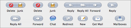
Apple Mail. There’s more.
The new toolbar does the icons-inside-buttons thing, which makes sense, and may be a usability gain.
However, here’s a weird thing I noticed:
When Mail is not the frontmost app, the buttons change their look: they look dimmed, disabled.

However, if you click, it’s actually enabled, it supports click-through. (This is true for non-destructive buttons, not all of the buttons.) Right before you click you see the mouse-over highlighting.
It turns out that the icon inside the button is used to indicate whether it’s enabled or not. Standard toolbars dim and un-dim the icon too—it’s just that they don’t also have a button being used to indicate status (sorta).
So the dimmed button look means “I’m in the background” rather than “I’m disabled.”
Safari’s icons are similar in that the icon rather than the button indicates status—but they don’t have a special dimmed in-the-background look, which I think confuses things in Mail.
Apple Mail.
I’m a little obsessed with it. I don’t even use it. But it’s the Apple app that’s most like our software, so Mail’s design informs our design.
I got a feature request that asked for NetNewsWire to adopt the following from Mail:
When the list of messages has focus, page-up and page-down should scroll the message view.
When I heard about this, I couldn’t believe it, so I checked it out, and it’s true. I can see how it’s a useful feature—but it’s also weird, isn’t it? If a scrolling view has focus, shouldn’t page-up and page-down work on the view with focus? Shouldn’t it work on the message list view?
Well, yes.
Nevertheless, having a keyboard method of scrolling the message view when the list view has focus is useful. (Space works, but it also goes to the next message when it reaches the bottom, so a scroll-only command would still be useful.)
So then I wondered about the list of mailboxes. One of the things I didn’t like about earlier versions of Mail was that you couldn’t use the keyboard with the mailbox list.
Do not try the following:
1. Select a message in the message list view.
2. Click on a mailbox in the mailbox list.
3. Hit the Delete key.
What happens is that the currently selected message in the message list view gets sent to the Trash. This happens because the mailbox list does not get focus when you click on it. (You don’t necessarily realize that, though, since there aren’t any focus rings. Focus rings are passé these days.)
However... if you hit the Tab key (once or a few times) focus will move to the mailbox list. The selection color changes to blue when the mailbox list has focus.
Once the mailbox list has focus, you can navigate using arrow keys. Cool. And now if you hit Delete, nothing happens, which is probably best.
You can probably figure out why it works this way—Mail has a sort-of “focus gravity” for the message list.
When you’re not writing an email, the message list has focus most of the time, unless you go out of your way to change the focus. (Even clicking in the mailbox list won’t change the focus.)
I understand it, it makes sense—because most of the time you want the message list to have focus. If you don’t have to check to see if it has focus, that’s cool.
But here’s the problem:
1. The message list doesn’t always have focus, it just usually has focus. So you do still need to click on it or hit Tab or whatever sometimes.
2. There is at least one situation where you can trash email without necessarily realizing it. (Described above.)
3. The concept of focus is a fundamental user interface concept. (Most users probably use the word “active” instead, as in, “The mailbox list does not become active when you click on it.”) But Mail does odd things, sometimes paying attention to focus, sometimes not, and not always doing what you’d expect.
Note that you can (obviously) learn Mail and all its exceptions, and even like them. However, I suspect a normal treatment of focus would be more usable.
Focus rings are those blue outlines you see sometimes. For instance, the below is from Safari’s bookmarks editor. The Collections and Bookmark lists get a focus ring when they have focus.

Mail doesn’t use focus rings around the mailbox, message list, or message views. If it did, it would be more obvious that a click on the mailbox list doesn’t move focus—you’d still see the focus ring around the message list.
Without the focus ring your main clue is the selection highlight color.
Here’s why I think we don’t see focus rings very often these days:
1. If you have a focus ring, you need a margin so that the focus ring has somewhere to draw. (Again, note Safari’s bookmarks editor, which has a margin.) Margins on non-metal apps are old-school: the modern look is no margins, which means no focus rings.
2. The blue outline itself looks rather old-school: it’s not sleek enough, just kind of thick and fuzzy. Seems busy.
Of course, focus rings are used, even in Mail, at least a little bit—search fields tend to get a focus ring.
![]()
(Editing the name of a mailbox also gives you a focus ring. There are probably other cases too.)
The thing about focus rings, though, is that they serve a great function—they make it really super-easy to know where the focus is. A replacement for focus rings—either a new look or something different but just as effective—would be a good idea. It would have made the accidentally-trashing-email scenario much less likely.
(Of course, I also think that clicking in the mailbox list in Mail ought give focus to the mailbox list. If it’s good enough for iTunes, why not Mail? If you can Tab there, why not click there?)
There are super-smart user interface people at Apple. The folks who came up with Exposé, for instance, thought out-of-the-box and came up with an innovative solution. But OS X has been a step backwards for focus indication, which makes using your computer just a little bit harder than it should be. I’d love it if some of those super-smart UI folks took a look at the problem of focus indication. It feels like there’s a great solution begging to be invented—I just don’t know what it is.
I mentioned at the top that I don’t use Mail. It’s not because of the user interface; it’s not because of the toolbar buttons or the focus issues or anything like that.
It’s the text editor. For the amount of writing I have to do, I need a great text editor—so I use Mailsmith.
The glossary feature alone is worth it for me. I also very much appreciate that it uses > characters instead of that quote bar thing that can be so hard to manipulate. Etc. I’m not trying to sell it to you—just saying that doing email without a strong text editor is out of the question for me personally.
(I also have used and quite like the combinations of mutt+vim and mutt+BBEdit.)
Mailsmith’s UI is not flashy at all (it even has margins and focus rings!)—and I often think about how I’d like to give it a make-over. But then again I think that about most apps, and it doesn’t stop me from using the apps that make me the most productive.
ridiculous_fish: Nil: “What does sending a message to nil do in Objective-C? What value does it return?”
The article is by an AppKit programmer at Apple who just started blogging. Very cool.
Before OS X, the common shape for Mac buttons was rounded rectangles.
![]()
Then, in early versions of OS X, the new thing for buttons was the capsule shape—as you still see in dialog and sheets, for instance.
![]()
Then, with the iApps and Safari, the new new thing was rounded rectangles.
![]()
![]()
But—think about it—aren’t you getting just a little bit tired of the rounded rectangles?
Though Tiger has lots of rounded rectangles, it appears to me that the new new new thing is the capsule shape. There are differences, of course:
1. They tend to be flatter—they aren’t as 3-D as OK and Cancel buttons, for instance.
2. They use either a single gradient—or they use that two-gradient glass look (that you see in many other places and is itself a trend worthy of note).
![]()
(You do still see plenty of rounded rectangles, especially for objects that aren’t exactly buttons—the line of Dashboard widgets at the bottom of the screen, for instance. A capsule shape doesn’t work that well when the rectangle is a square.)
What is most interesting to me about the current capsule buttons is that we have competing visions: single gradient vs. glass look. Note for instance these two Save buttons, one from the Finder and one from Mail. The Finder button uses a gradient, while the Mail button uses the glass look (which it also uses in its toolbar buttons).
![]()
![]()
(It’s as if hemlines have shortened a bit this year—but both basic black and floral prints are in style.)
Also interesting is that the Finder is using the capsule shape with popup menus. I don’t recall ever having seen that before. I quite like it.
![]()
(We almost used this same widget in NetNewsWire, by the way: it would have been in the header cell above the subscriptions list; it would have allowed you to choose the sort order. We decided against it for reasons other than the appearance of the widget itself. [Our version was smaller than the widget shown above, to better fit that space.])
Rounded rectangles will be back, probably some time next year. But there will be something different about them that I can’t predict. (Flatter? Less flat? Or...?)
But, right now, capsules are the thing.
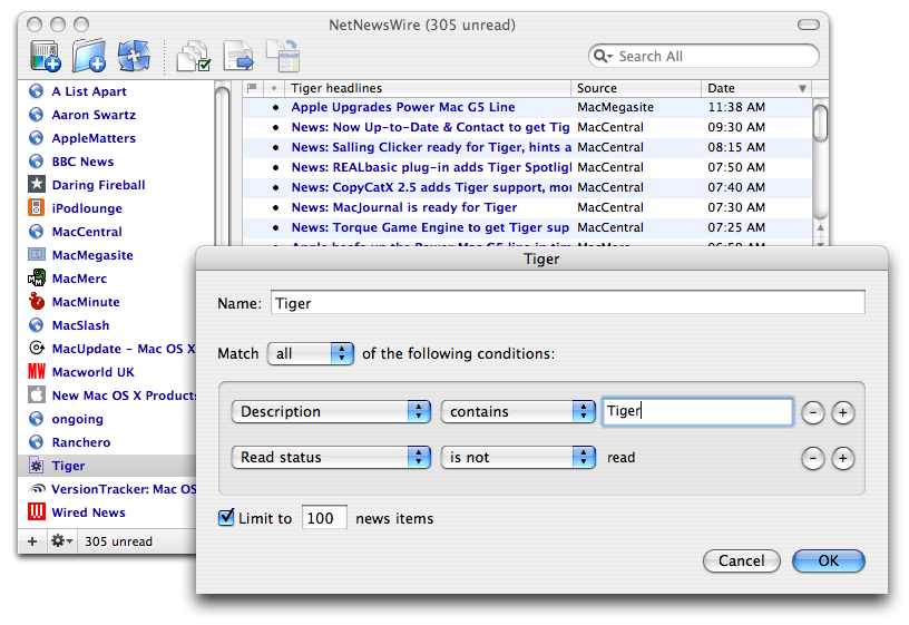
Smart lists of various kinds are not new to Tiger, but they’re ever more important.
Say you’re a developer and you’re adding a smart something to your app. So you take a look at what other apps do.
iTunes...
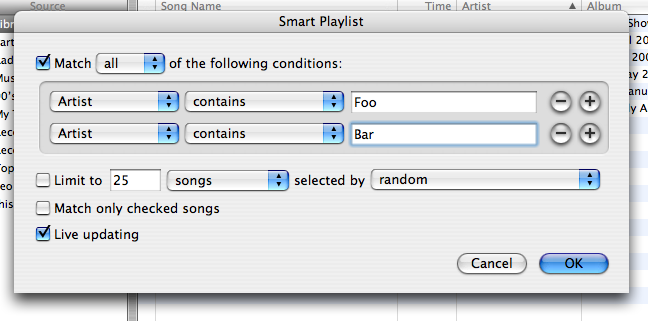
Mail...
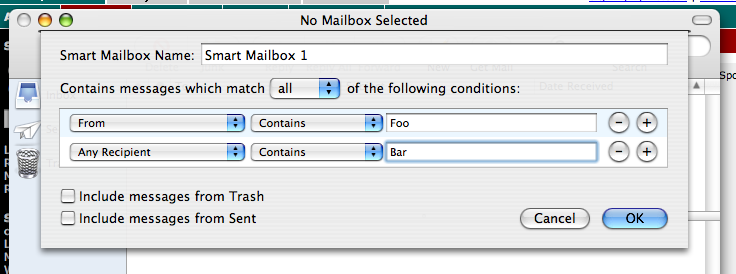
Finder...
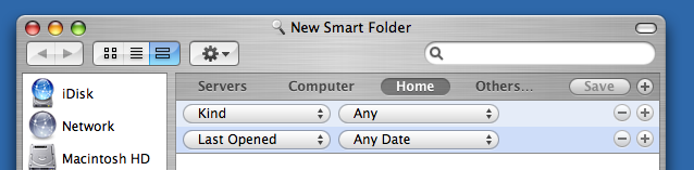
Here’s what you the developer can conclude...
1. Smart list creators must appear in a separate modal window. Or in a sheet. Or not in a separate window at all.
2. They must have + and - minus buttons that are, well, consistently round.
3. They must use large popup menus. Or small ones (even if the other controls are large). Or they could use a custom popup menu control that looks really, really cool.
4. The background of the rules should be a dark gray. Or, no, they should be alternating colors: blue, then white. Or, no, they should be lighter blue then darker blue.
5. The box containing the rules should have rounded corners. Or not.
6. A smart list creator should have an OK button that saves it. Or it should have a Save button.
7. A smart list creator must give you a place to set its name. Or not.
8. A smart list creator should give you the option to choose between matching all or any of the criteria. Or not.
P.S. A really cool innovation would be a consistent user interface for smart thing creators.
Everyone’s familiar with Safari’s cool buttons, right?
Here, for example is the home button—first in normal and then in pressed state. Note how it highlights in blue. (Why it doesn’t highlight in graphite if you’re using graphite I won’t try to explain, because I can’t.)
![]()
![]()
If you look at Tiger, you can see this same button style used in lots of different places: System Preferences, Dictionary, Finder, Help Viewer, Address Book, Font Book, and so on.
So I was checking out Interface Builder in Tiger, and I see that Apple has now provided this as a standard button type—which is very cool. Here’s a screen shot from Interface Builder:
![]()
This is how things should work, I think: some folks on an app team come up with a new button, it stands the test of time (people like it and it’s usable), other apps adopt it, and it becomes a standard button type available to any developer. I’m all set to applaud, in other words.
It’s not necessary for Apple to make a certain button type available before developers can create buttons that look and feel exactly the same way.
There was never anything stopping anybody from making buttons that look and feel the same as these Safari-type buttons.
Making custom buttons isn’t hard: you just need to create images for the buttons. (Sometimes you have multiple images, of course: normal, pressed, disabled, sometimes mouse-over, and sometimes graphite variants of the above.) You may need to write just a little code that says how the button should behave (does it toggle between two states like a checkbox, or is it like an OK button, that kind of thing).
But when a button type becomes a standard, then it’s slightly easier for a developer to use, because you just need to create the icon that goes inside the button, and you don’t have to deal with the extra stuff.
More importantly, it means that this button is now considered part of the OS X user interface, and you can use the button with confidence that you’re being consistent. (Presumably there is also some documentation that says when and how the button is best used.)
So after dragging the button to a window in Interface Builder, I “ran” the window to see the button in action. I clicked on it. It looked like this when pressed:
![]()
Looks good, right? A nice “pressed” look.
But see the problem? It’s not blue.
Here’s what would happen were you to release an app that uses this button. Users would report it as a bug that the button doesn’t turn blue. They’d point to some of the many different apps that use this same button, and say, “See? The standard on OS X for these buttons is that they’re blue when pressed!” The users would be absolutely right.
So then you have to go back to the custom method of making images for each of the states and perhaps writing a little code to get the behavior right. Not hard, but you’ll have to do it.
But now you’ll wonder why you have to do it, when this button exists as a standard button type in Interface Builder.
I don’t know.
The worst-case scenario is that the policy is to give developers some cool widgets, but don’t make them the same as what Apple uses—make it so developers have to jump through some extra hoops.
I don’t believe that scenario—it’s rather paranoid. I mention it because I’ve heard it from other developers.
My guess is that, simply, it’s an oversight, just a mistake.
You might wonder why I’ve been writing all this about watching trends in OS X user interface design.
The main point is not to ding Apple for UI inconsistencies. The point is that it’s absurd for developers to have to spend so much time watching trends in OS X user interface design.
I want Apple to innovate, to try things, to make things cool—and I want them to continue as the leaders in usability, which I still think is the big draw of Macs. It may be a tight-rope act, but Apple has been doing this particular high-wire dance for decades now.
At the same time—at the same time, please sing some arias—I know I’m asking alot—I’d like to see some leadership beyond just sometimes-contradictory examples.
More on trends in OS X user interface design...
I don’t understand what’s happening to splitter bars. (The part where you grab and drag to resize a split view.)
Here’s what the Human Interface Guidelines has to say on split views.
The splitter bar displays a circular dimple at its midpoint that indicates to the user that it is draggable...
In a metal window, the width of a splitter bar is 7 pixels...
In a standard Aqua window, the width of the splitter bar is 9 pixels...
You’ve probably already noticed that splitter bars come in different sizes. (Compare the iTunes splitter bar to the Finder’s, for instance.)
You may not have noticed a couple other details that I just can’t explain:
1. The dimple in the Finder looks different from the dimple used in iTunes. Here they are, magnified:


Subtle, but, you know, it’s light-source stuff, which Apple has historically mastered.
2. In iTunes there is a light-colored border on either side of the splitter bar—but that’s not true in the Finder. (See second graphic above.)
But those differences aren’t that big, really. At least the splitter is still recognizably a splitter.
This goes back to the goodbye-stripes thing...
You will not find in any of Apple’s apps outside of utilities (or Sherlock) a splitter bar that looks like a standard non-metal splitter bar. You won’t see this:
![]()
You would expect to see the above in Mail, because Mail is not metal.
Mail’s horizontal splitter bar looks like this:
![]()
The drawing is custom, for Mail only as far as I can tell. (No stripes! Gradient! Cool custom dimple! I like it! No kidding—I really do like it.)
But what is really odd to me is the vertical splitter bar, which looks like this:
![]()
It’s a one-pixel-wide line separating an area of blue from an area of white.
I can easily explain this from a coolness factor—but I can’t explain it from a usability standpoint, because it’s very difficult to grab such a narrow target. (And it doesn’t resemble a splitter bar at all, so you don’t necessarily realize that you can grab it.) To make up for it, they’ve added a little grab thing at the bottom of the window which is easy to grab. (Which I also, no kidding, really like.)
![]()
Here’s the thing—this isn’t the only non-metal app to completely avoid standard splitter bars.
Look at Keynote, for instance. No splitter bar at all, just a grabber at the bottom. But, though similar, it’s different from Mail—in Keynote you can’t grab the splitter bar at all, you have to use the grabber at the bottom.
And then there’s Xcode—also non-metal, and with yet another custom splitter bar.
![]()
The trend is clearly to avoid standard splitters in non-metal windows.
I have no theory to explain it other than as a coolness thing—stripes are not cool, we must not have stripes.
But even still I have trouble explaining Mail’s vertical splitter, which appears to me to be too much of a triumph of coolness over usability. You might like it—heck, I like it too, it’s cool—but is it too much of a usability hit? When is a cool idea not worth it?
Here’s the thing to remember: developers look to Apple for guidance. If Apple’s UI decisions say that it’s okay to sacrifice usability for a distinctive look, then many developers will do that. It’s a long, long way away—but at the end of that particular road is Windows.
More about trends in OS X user interface design...
I have a theory about what happened to Mail’s toolbar.
Apple’s Human Interface Guidelines page about toolbar icons shows examples from the pre-metal Finder and the pre-Tiger Mail.
Each toolbar icon should be easily and quickly distinguishable from the other items in the toolbar. Toolbar icons emphasize their outline form, rather than subtler visual details.All the icons in the new Mail are clearly designed to de-emphasize unique shapes.
Of Apple’s apps that come with Tiger or with a new computer, I can’t think of any whose toolbars emphasize unique shapes. (And then there are apps that don’t have a standard customizable toolbar, such as iTunes and iCal, that I’m not counting.)
My guess is that, simply, Apple changed its mind about the unique shapes.
This isn’t necessarily bad—and there are new consistencies and usability gains being made. Note, for example, how the back/forward button set is the same in Safari, Help, System Preferences, Dictionary, and probably other places. This is a good thing.
So the trend is toward regular shapes—and also 1) away from color, and 2) toward a more button-like experience, and 3) toward more stylization, less representation.
The Mail toolbar designers got the memo, it appears.
John Siracusa famously said that it appeared as if Mail had got “beaten with the ugly stick.” Not everybody agrees—it’s a matter of taste. (And I bet some people are starting to change their minds.)
The problem, though, is that Mail is a very different program from Safari, Help, System Preferences, and so on. The Safari-type buttons you see all over—back/forward and home, especially—are not appropriate for Mail. Mail needs things like Flag, Show Headers, Junk, and many more which don’t exist in any other Apple app.
But that leads to a quandary: you want to use the same regular button shape lots of other apps are using, but that button works best with grayscale icons, not with Mail’s more colorful icons. At the same time you want to keep some of the colorful icons because people have already learned what those icons mean. (And some—Junk, for example—are used in other parts of the interface, and you want color to draw the connection.)
So my guess is that somebody made the following decision: let’s invent a new regular shape, and stick modified versions of the old icons inside this new shape, so it’s like a button. (And let’s have it highlight on mouse-over, because people like it when buttons do that.)
Best of both worlds: regular, more button-like shapes and the already-learned icons.
Depending on your taste, it didn’t work out at all, or it worked out splendidly and is another master stroke of Apple design.
You’ve probably worked all this out for yourself well before reading this. It’s just that I enjoy forensic UI design, looking at apps and trying to figure out why things happened the way they did.
My point mainly is to point out the trends in OS X toolbar icon design: regular outlines; icons inside the outlines (button-like); grayscale instead of color; and bolder, more stylized figures.
I have some theories on why these are the trends:
1. People understand buttons! So making toolbar icons more button-like is a usability gain. My suspicion is that Apple found that some users didn’t realize they could click on the toolbar icons in the older version of Mail, since they don’t look like buttons.
2. Regular outlines feel simpler, and therefore better, than different outlines. (But this may be a usability loss, because different outlines are easier to pick out. Possibly outweighed by #1 above.)
3. To many people, grayscale signifies elegance. And everybody wants their stuff to be called elegant.

As an admitted UI-trend-watcher (it’s part of my job)—here’s a trend I’ve noticed: OS X has gone from very stripy to moderately stripy to not very stripy.
Remember back to the public beta, and 10.1 and 10.2. Lots of stripes. Remember before the Finder used brushed metal? Remember how even title bars had stripes—and how the stripes everywhere were very pronounced?
At the time, of course, OS X got high marks for the beauty of its interface.
But the stripes didn’t wear well. The first implicit acknowledgment of that from Apple was so many brushed metal apps on Jaguar—I’m not sure that it was that the metal look was so cool: it was more that people were already getting tired of the stripes.
And then the stripes were way toned down on Panther (10.3); the Finder became a metal app; window title bars became gradients (when active).
Now with Tiger (10.4) the stripes disappear even more.
Note for instance the unified title and toolbar look, a new window style that System Preferences, Mail, Dictionary, Xcode, and Help Book use. No stripes in the toolbar when the window is active.
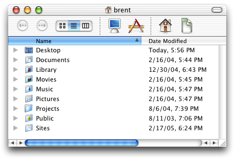
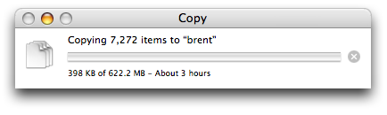
Note how even the Finder copy window uses a white background instead of a stripy background.
The upshot is that it’s getting harder to find stripes in Apple apps—at least not in the main window (prefs and sheets are different).
Going through my Applications and Utilities folder, it looks to me as if two things about Apple apps may be true:
1. If an app is possibly on its last legs—Sherlock, for instance, which has been superseded by Dashboard and Spotlight—it’s not getting much attention and so it’s still rather stripy.
2. If an app is a utility, not one of the big appeals of OS X—TextEdit, Script Editor, Disk Utility, Activity Monitor—then it’s still stripy, since these apps are the kind of thing you dig for, not the kind of thing that appears in marketing. (Note for instance that Automator is metal while Script Editor is stripy.)
Anyway, that’s it, just an observation. Bye-bye stripes.
I’m curious—which Apple apps do you use the most? I mean, outside the operating system itself.
As a developer, my personal list is rather boring: Xcode, followed by Terminal. (I use Camino as a browser and Mailsmith for email, or else Safari and Mail would be way up there for me.)
(I wish I could say GarageBand was high on my list, but I need to carve out some time for it.)
My second favorite Tiger feature is that you when you change the file system via Terminal, the Finder notices right away.
Seems like a small thing, but it’s huge. (Trump-huge. The grandest, most beautiful, most luxurious feature ever.)
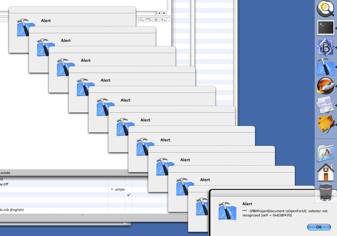
A new feature in Xcode 2.0 is cascading alert windows.
(Just joshing. I kid, but Xcode knows I love it. It’s like a sign on a café here in Ballard: “We’ll treat you like family. Sorry.”)
So, I’m curious, which do you prefer, Fink or DarwinPorts, and why?
I’ve just been doing the configure/make/make-install thing (as my people have done for centuries) but I’m thinking that a package management system might be a good idea.
My favorite Tiger feature is that I can turn off the caps lock key. Yes!
I hit that key several times a day accidentally, and it just drives me nuts. I never actually use it for anything—it’s just an annoyance.
No longer!
![]()
In case you haven’t run across it, here’s how to turn it off.
1. Open System Preferences.
2. Click on Keyboard & Mouse.
3. At the bottom of the Keyboard tab is a “Modifier Keys...” button. Click it.
4. A sheet appears that lets you remap caps lock (and other keys). Choose “No Action” from the popup menu, then click OK.
It is a thing of beauty.
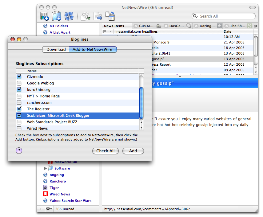
One of the common questions we get these days is about subscribing to multiple gmail accounts with NetNewsWire. Here’s a tip which describes how to do it.
![]()
Just for jazz, here are some other places to look for tips and tricks:
1. In the Help book, on the Tips page and on the Questions & Answers page. (Choose NetNewsWire Help from the Help menu.)
2. On the NetNewsWire Tips page on this site. (Which is where we add tips that haven’t made it into the Help book yet or that we think need extra emphasis.)
3. On other NetNewsWire Resources pages.
(And don’t forget Google!)
Argh! There’s like a weblog-chain-letter thing where you have to give details about your music habits. It was passed to me by Chris Clark of decaffeinated.
Total volume of music files on my computer
0 bytes.
Because, well, for some weird reason I just don’t trust myself—or the DRM gremlins—not to lose it all. It doesn’t feel permanent. (I grew up with albums, by the way, so my subconscious is a couple formats behind.)
The last CD I bought was
David Bowie, Reality
Song playing right now
The TV is tuned to a cable news channel, for I am a news junkie.
In my head, though—there’s always a song playing in my head—is “Bankrobber” by The Clash.
Five songs I listen to a lot, or mean a lot to me
“Call of the Wrecking Ball” by the Knitters.
“London Calling” by The Clash.
“Vincent Van Gogh” by Jonathan Richman.
“Take the Skinheads Bowling” by Camper van Beethoven.
“If I Should Fall from Grace With God” by The Pogues.
Five people to whom I’m passing the baton
First, my apologies. I decided to help make sure fellow Mac developers get the curse baton.
I always install new versions of OS X as clean-slate installs—I have it wipe the partition and do a completely new install. Then I move back my files and prefs, rebuild whatever Unix apps need rebuilding, etc.
Why do it that way? The idea is to remove doubt.
If you don’t do a clean install, and something goes wrong later, there’s that little bit of doubt that maybe the problem wouldn’t have happened had you done a clean install. And now you wonder if maybe the problem won’t be solved without doing a clean install.
You upgrade your own Mac, right? That makes you a Unix system administrator. Smart admins do as much as possible to avoid potential causes of doubt in the future. Doubt is a parasite that lives in computers.
With the release of NetNewsWire 2.0 finished I can finally upgrade to Tiger. I’ve been running it on a test machine, but haven’t yet upgraded my development and day-to-day machines.
If you’re not a developer, you may not realize that upgrading to a new version of OS X also means upgrading the development tools—which can have unexpected side effects. It’s not something you do during the final phase of shipping software, which is why I had to put it off until now.
So today is the day to get Tiger running on my development machine. Depending on how things go I’ll be able to get all my projects building and running fine. (I did some practice builds on my test machine, and all was well.)
After getting Tiger installed, my next step is to move from cvs to Subversion. I’ve been looking forward to it for months.
I’m taking an infrastructure break, in other words. For me it’s fun.
We’ve had lots of people tell us that they really like how NetNewsWire uses the unified title/toolbar look on Tiger. And we’ve heard from two people who prefer the traditional Aqua horizontal stripes.
Things like this are very much a matter of personal taste, of course.
At any rate, anticipating that there would be a few people who prefer the traditional look, we added a hidden pref that tells NetNewsWire to use the traditional toolbar look.
Here’s what to do:
1. Quit NetNewsWire.
2. In Terminal, copy-and-paste the following then hit return:
defaults write com.ranchero.NetNewsWire traditionalAquaToolbar YES
3. Launch NetNewsWire—it will use the horizontal-stripes toolbar look.
If you want to go back to unified title/toolbar, repeat the above but with NO instead of YES.
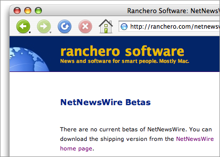
The below is possibly my very favorite screen shot. (It’s of the NetNewsWire Betas page.)
A reminder—I’ll be at an informal forum at the Seattle Xcoders meeting tonight on the topic of small Mac software business. If you live in or near Seattle, and the topic interests you, it would be cool to see you there.

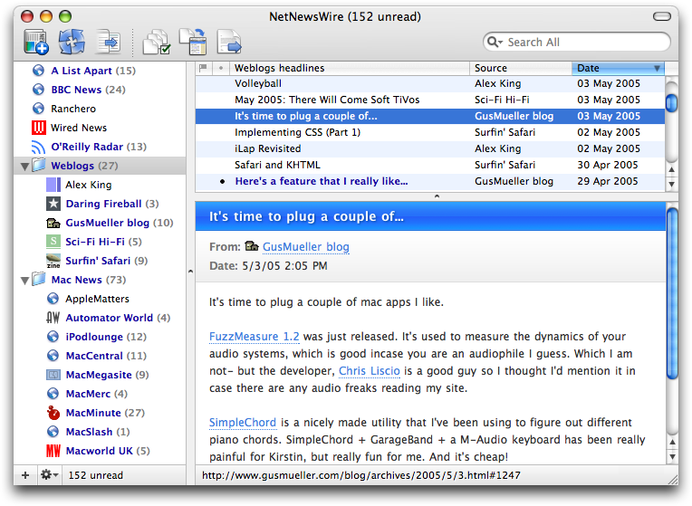
NetNewsWire 2.0—full and Lite—has been released!
Here’s what’s new in 2.0.
Here’s the official announcement on ranchero.com.
And here are a bunch of screen shots (click the thumbnails for the big version):


Astrobiology Magazine: Moonbase Divining for Lunar Water: “Whether a moonbase will turn out to be feasible hinges largely on the question of water. Colonists need water to drink. They need water to grow plants. They can also break water apart to make air (oxygen) and rocket fuel (oxygen+hydrogen).”
On May 12 I’ll be at the next Seattle Xcoders group meeting, answering questions about running an independent Mac software business. It’s an informal forum, just questions and talk. (Click the link above for details on what the Xcoders group is and where it’ll be.)
See you there, I hope!
Teal Sunglasses: Rules for cats: “Do not allow any closed doors in any room. To get door open, stand on hind legs and hammer with forepaws. Once door is opened, it is not necessary to use it.”
One of the changes in Tiger is that if you have set the Finder to show all file extensions (via the Advanced panel in the Preferences window) then you see the .app extension for applications.
This used to be a special case in earlier versions of the OS: you wouldn’t see the .app extension.
I understand the change, because I understand the desire not to have special cases. (That’s not to say I agree with it. Maybe, maybe not. I haven’t formed an opinion yet.)
It did trigger a bug in NetNewsWire in Tiger: if you click Post-to-Weblog, and you have the Finder set to show all file extensions, then it wouldn’t work. Your weblog editor would launch but it wouldn’t open a new document window.
The next build of NetNewsWire will fix the bug, of course. In the meantime, if this is a deal-stopper for you, you can temporarily work around the bug by telling the Finder not to show all file extensions.
Daniel Berlinger is due to become a father today. Good luck to Daniel, wife, and baby!
(Daniel and I go way back. Though we’ve never met in person, we’ve been online friends for ten years.)
Tiger has provoked some new reports regarding favicons in MarsEdit and NetNewsWire. In some cases, favicons that didn’t work now do work. In other cases, favicons that did work now do not work.
An example is Yahoo’s favicon. Try this in Panther and Tiger:
curl 'http://www.yahoo.com/favicon.ico' > yahoo.ico

open yahoo.ico
On my machines, Preview tries to open the file. On Panther it succeeds. On Tiger I get an error message saying that the file “may be corrupt or a file format that Preview doesn’t recognize.”
(I’ve just taken you the long way ’round. You could open Yahoo’s home page in Safari and note that its favicon doesn’t appear in the address field on Tiger.)