OS X user interface trend: goodbye stripes
Remember the Finder
Remember back to the public beta, and 10.1 and 10.2. Lots of stripes. Remember before the Finder used brushed metal? Remember how even title bars had stripes—and how the stripes everywhere were very pronounced?
At the time, of course, OS X got high marks for the beauty of its interface.
But the stripes didn’t wear well. The first implicit acknowledgment of that from Apple was so many brushed metal apps on Jaguar—I’m not sure that it was that the metal look was so cool: it was more that people were already getting tired of the stripes.
Remember Panther
And then the stripes were way toned down on Panther (10.3); the Finder became a metal app; window title bars became gradients (when active).
Now Tiger
Now with Tiger (10.4) the stripes disappear even more.
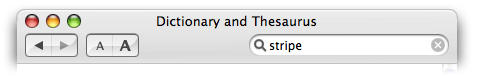
Note for instance the unified title and toolbar look, a new window style that System Preferences, Mail, Dictionary, Xcode, and Help Book use. No stripes in the toolbar when the window is active.
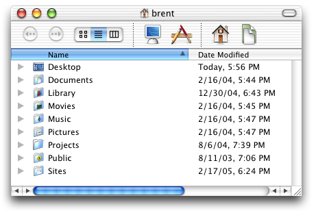
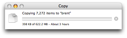
Note how even the Finder copy window uses a white background instead of a stripy background.
The upshot is that it’s getting harder to find stripes in Apple apps—at least not in the main window (prefs and sheets are different).
Going through my Applications and Utilities folder, it looks to me as if two things about Apple apps may be true:
1. If an app is possibly on its last legs—Sherlock, for instance, which has been superseded by Dashboard and Spotlight—it’s not getting much attention and so it’s still rather stripy.
2. If an app is a utility, not one of the big appeals of OS X—TextEdit, Script Editor, Disk Utility, Activity Monitor—then it’s still stripy, since these apps are the kind of thing you dig for, not the kind of thing that appears in marketing. (Note for instance that Automator is metal while Script Editor is stripy.)
Anyway, that’s it, just an observation. Bye-bye stripes.