August 2006

Rock Star: Addict
I can admit it—I’m addicted to Rock Star: Supernova.
Last night I thought they should have dropped Patrice. She smiles way too much, and she looks a little like Maria Cantwell. (Who I like as a senator but probably not so much as a rock star.)
I’m pulling for Dilana, of course. She’s pure magic. But I like Toby and Magni quite a bit too.
Having fun at WWDC
I’m in San Francisco at WWDC, having fun! But too busy to blog! More later...
If you’re in or near SF, come to Buzz’s party tonight!
Papa kitty

Papa dreams of WWDC.
Small cosmetic change in status bar
It might be kind of silly to make any cosmetic changes right before WWDC—and I leave open the possibility that I’ll reverse the following change or change it again.
NetNewsWire 2.1:

NetNewsWire 3.0d7:

I’ve been working toward making NetNewsWire higher-contrast. The trend (as I’ve written about recently) is to make the control areas at the top and bottoms of windows dark, to contrast better with the content area.
So NetNewsWire’s status bar went from the glass look to a darker gradient. I think it fits in better with the unified title-and-toolbar window style. (I could have made it even darker, but then it wouldn’t have fit with the window style.)
But... will we get new or changed window styles at WWDC? Will we see a new convention for status bars? I don’t know! There’s an excellent chance that what we’ll see this week will affect the look of NetNewsWire and lots of other apps.
The new Combined View and hybrid web/desktop apps
The new Combined View—I’m tempted to call it a bug fix rather than a new feature. The performance bug (and some sizing bugs) couldn’t be fixed with the old version. This was a case where only a complete re-write would fix the problems.
To re-iterate... the problem was that each item had its own separate webview, which meant tons of overhead. If you had 100 news items displayed, that was literally the same as having 100 small web pages open all at once.
So the obvious choice was to make it one big webview—a single web page—to get rid of that overhead.
But then there’s a whole other challenge: how do you make it so that you can still navigate with the keyboard? How do you have the concept of a selected item? It can’t just be the same as an online reader—it needs to have the features desktop app users expect.
The key to the whole thing is JavaScript. When something happens in the page—you click on a news item, for instance—the page calls back into the app, and the app tells the page how to update.
It’s kind of like Ajax in that way, except that the communication channel is not http and it’s synchronous (which it can be, since it’s right there on your machine).
Similarly, if you choose a menu item or click a toolbar button (such as Mark All As Read), then the app calls into the page to run some JavaScript. It doesn’t have to generate a new page—it just changes some classes, swaps some images, whatever it needs to do.
I’ve found that being able to do this two-way communication—page-to-app and app-to-page—allows for all kinds of clever stuff. You can add some nice touches. For instance, check out these two details:

In the first detail, the Combined View has focus. In the second, the subscriptions list has focus. (The Combined View also dims when the app is no longer frontmost.)
To get the dimming effect, the app calls into the page to tell it it’s inactive. The page then uses JavaScript to swap some CSS classes, which changes the display.
Anyway, I liked working this way enough (getting to exercise my JavaScript, HTML, and CSS chops) that I also did the same thing for the new Attention Reports feature. (Lifted straight from FeedDemon, by the way.) Those are also HTML pages—but with rollovers and all that. And when you click an unsubscribe button, it calls into the app, and the app displays the standard unsubscribe sheet.
This is all definitely a benefit of WebKit—it makes possible this kind of hybrid, a mix of desktop and web technologies. I feel like I’ve only scratched the surface.
PS In the screenshot above, how did I get the rounded corners in the current selection? CSS, plus four little graphics for the round corners. I’m not drawing on top of a webview or anything nutty like that—it’s pure CSS.
PPS The old Combined View—one item gets one webview—sounds bizarre. Why would I have done that in the first place? Well, the Combined View actually came before WebKit. Originally, each item was a separate NSTextView—recall that NSTextView had (probably still has) some basic HTML display. This was much, much faster than using WebKit webviews, mainly because the HTML feature in NSTextView was so very basic. Once WebKit came out, the natural thing was to switch from NSTextViews to WebViews. That’s how it ended up being the way it was.
PPPS I’m partitioning the hard drive on my laptop and re-installing OS X so I have a place to install Leopard (assuming we get Leopard disks at WWDC). Hence all the writing tonight. ;)
NetNewsWire 3.0d7: Super Early Sneak Peak
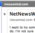
I want to try something a little different—I want to work on NetNewsWire 3.0 a bit more out in the open than I usually do. I’m not sure it’s wise, exactly—but it’s more fun for me. ;)
So I put up a super-early sneak peak release. It’s not a beta, it’s not even an alpha, it’s at 3.0d7.
You can download it here. (But I warn you with big red letters that it’s a work in progress, and you shouldn’t try it out if you’re not comfortable with it.)
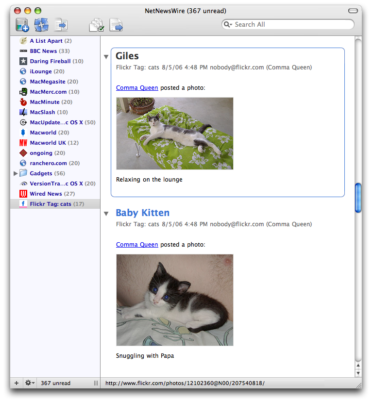
The big new thing—the thing I’m personally excited about—is the brand-new, totally rewritten Combined View.
The old Combined View (like a newspaper or river-of-news view, for those who don’t know) had some performance issues because every single news item was a separate webview. If you had 100 items, that was like 100 mini-web-pages.
The new version uses just one webview—but, even though it’s a single web page, you can still navigate with the space bar and arrow keys, you can still expand and collapse. It still has the concept of a selected item.
(Or you can just scroll and point-and-click. It works with both styles of reading.)
Here’s a screen shot of the new Combined View. Here’s another screen shot.
As I say, it’s a work in progress, and feedback (especially on the new Combined View) is definitely welcome. There will be a bunch of other new features and lots of bug fixes. (If you were hoping to see ____, and it’s not there, consider that it’s still early in the process. That doesn’t mean ____ is not on the list.)
Also—NetNewsWire 3.0 will be a free upgrade.
Dan Wood on resolution independence
Dan Wood on resolution independence: “Think of how you read a printed map (compared to a Web-based map), for instance... the detail is there if you want it; you can get closer to the map to see the tiny printing, or step back and get the big picture.”
When will Leopard ship?
I’ve been wondering when Leopard will ship.
My guess is that it’s farther along than you might think and that it will ship in October or November of this year. (If I had to pick a day, I’d guess October 27.)
The main thing is to get it out there before Vista, which is scheduled (still?) for January. So, if it’s going out before January, might as well get it out before Christmas, no?
Recall too that the timescale would be a bit like Panther’s: there was WWDC in the summer and then a release in late October. So there wouldn’t be anything unprecedented about an autumn release. Also recall that last year’s WWDC was all about Tiger, even though Tiger was already released—which means Leopard has been under construction for a while.
Fraser’s WWDC Hopes and Dreams
Here’s Fraser Speirs’ WWDC Hopes and Dreams: “It would be nice if someone at Apple could recognise that their 3rd party developer base are wasting time playing catch-up with the visuals instead of innovating on Apple’s platform.”
More on Leopard interface
Veerle’s blog: “I’m not focusing on making an educated guess in what’s coming hardware wise but like to think a little of possible interface changes in 10.5 Leopard.”
New developer technologies?
I wonder if there will be new developer technologies at this WWDC as important as Cocoa Bindings and Core Data in recent years.
I don’t think so—which doesn’t bother me at all, actually. I do expect new technologies, and I expect improvements to Bindings and Core Data, but I don’t expect big new fundamental technologies like these.
My reasoning is pretty simple. Cocoa apps are generally built using the Model-View-Controller (MVC) pattern. Back in the early days of OS X we already had View technologies, but not much for Model and Controller. Then Cocoa Bindings came along, which covered the Controller part. A year later Core Data appeared, which covered the Model (data) part.
So we’re covered (M, V, and C) and I don’t expect fundamental new developer technologies.
But of course I stand ready to be surprised by things I didn’t think of!
Take Mike to WWDC!
Michael McCracken: “I can’t make it in person to either WWDC or Buzz’s party this year, and as a result, I’m bummed right out. But I haven’t sulked, I thought of your feelings too. I came up with a way to make it seem kind of like I was there anyway. It’s so crazy, it just might work...”
More WWDC speculation
Here’s Daniel Eran’s WWDC guesses and wishes.
Nick reports in
Nick Bradbury: Dumbass in a Sea Kayak: “It started when I decided to take my seven-year-old son Isaac out in a tandem sea kayak, something he’s enjoyed several times before. It looked like a storm was brewing, but I thought it would be a while before it reached us...”
Luis’ guesses
Here’s Luis’ wild guesses for WWDC.
Virtualization and the Mac world
Here’s Paul Kafasis and Daniel Jalkut on the possible impact virtualization could have on Mac developers.
Good kitty, good kitty, nice kitty

Gus’s list
Here’s Gus’s list of WWDC guesses.
More random guesses
In no particular order, here are some random guesses about things we might see at WWDC (not all of which may be public, of course):
- The end of Sherlock. (Probably wouldn’t be announced—we’d just discover it’s missing when we install Leopard.)
- Safari with sidebar/source-list thing. I’m not sure what it would do, I just have a hunch it’ll be there. Consider all the widescreen monitors these days.
- Steve Jobs telling us about the great reaction to the “I’m a trust-fund POS Mac, I’m a PC” commercials.
- Tabbed Finder. Will it really be better, or the same thing with tabs? At least the brushed metal will be replaced with iApp smooth metal. (Surely. If not, I’ll be very surprised.)
- Dashcode.
- Way faster compile times. (Okay, I’m totally dreaming. But I can hear Jobs’ voice talking about how Apple engineers worked with the gcc engineers to something-something-performance-something. Please let it be so!)
- Something Intel-ish. Something Mac-first and Intel-ish.
- Garbage freaking collection for Cocoa apps. (Which I actually don’t care about personally, but I’ll believe you if you say it’s a good thing.)
- News that Apple has acquired Parallels. (“We liked it so much we bought the company, and now Macs are the best computers for running Windows, even Vista—once it eventually ships.”)
- Kitty cats.
Big-time tabs control wanted
In my head I always call it the “big-time tabs control.” (I doubt the name would stick—NSBigTimeTabView? Nah.)
Here’s what I’m talking about...
You’re well-acquainted with tabs like this:
![]()
It’s a completely standard part of Cocoa, easy to do, works the same in each app, nice and consistent, all that.
But what we don’t have is a tab control for when there are lots of tabs and they don’t always all fit. Every developer does it their own way.
![]()
![]()
![]()
![]()
Developers do a good job—I haven’t seen a case where I didn’t recognize the tabs as tabs. So, functionally, we’re fine.
But still, it seems like an area where a new type of standard built-in tabs control would be cool, so that each developer doesn’t have to reinvent the wheel, so that there’s a standard look and behavior.
It’s another thing I’d love to see at WWDC, at any rate. Likelihood is low, I’d say, but still, here’s me, dreaming.
PS The first one in the set of four is actually Safari, but I’ve modified my Safari to use the unified look instead of brushed metal, so the tabs end up looking different. (I’m so looking forward to a non-brushed-metal Safari. I think it’s a cinch to happen. I doubt it would be unified—more likely it will use the successor to brushed metal look that other iApps are using. Heck, the browser controls might even get moved to the bottom.)
Cocoa open source would be cool
Here’s something I’d totally love to see at WWDC: the Cocoa framework open-sourced. Foundation and AppKit both.
It’s not that I want to work on it, and it’s not that I want to use _undocumented _private _methods, it’s that sometimes it would be really helpful to have the source so I can see what’s going on under the hood.
There are times when things don’t work as expected, or there’s some weird bug, and I want to look at the source—and be able to debug with the source—so I can see what the heck is actually going on.
I understand entirely that making Cocoa open source means a bunch of work. It wouldn’t be easy; it would be expensive. But Apple does have the WebKit experience to draw on.
And there are other drawbacks. But one drawback I think doesn’t exist: they don’t have to worry about competition. Is there somebody else who wants to create an Objective-C application framework for OS X? (Ah, nope.)
Apple would get big points for openness and generosity and developer support. (Assume that part of this would be making the bug tracker open to developers.)
(I have absolutely no inside knowledge. This would be an exciting and cool thing to have happen, but I put its likelihood somewhere around 0.01%.)
WWDC UI wild guesses
Like thousands of Mac developers, I’m getting all excited for WWDC next week. Bring on the Leopardy goodness!
The main thing I pay attention to is the user interface changes. I have some wild guesses as to what we’ll see.
I think we’re going to see a continuation of a few trends in the look of OS X. It will get higher-contrast and less 3D. (It will resemble more and more an updated NeXT look.)
I was talking to John Gruber recently about this (one of the perks of vacationing in the Philly area)—he said that he thought Apple was setting out to make Vista look like a toy when compared to a more refined and professional OS X. Sounds right to me.
And that means more contrast, less transparency, a flatter look, subtler uses of 3D and shadows. Vista would end up looking like OS X 10.1 in comparison. (All this is speculation, of course, I have no inside knowledge and I’ve seen just a few screenshots of Vista.)
So what all will happen in UI-land?
Will brushed metal disappear?
You’ve noticed that brushed metal has just about disappeared from the iApps—it’s been replaced by a new window type that isn’t a standard part of the system.
I can imagine brushed metal disappearing entirely in Leopard—any app that would be brushed metal on OS X 10.4 would automatically get this new type of window on 10.5. In fact, that’s what I hope will happen—this new type is obviously the successor to brushed metal, and so it’s time to let go of brushed metal entirely.
This new type has some obvious advantages. Like brushed metal it contrasts better with white and light colors, and unlike brushed metal it’s nice to look at. More elegant, less let’s-make-the-12-year-olds happy. (If you like brushed metal—I apologize. But it’s still going away.)
Another possibility is that this window type will replace the old horizontal-striped look or will replace the unified title-and-toolbar look. I doubt either of those outcomes.
The worst outcomes would be that it’s a brand-new type or that it’s simply not available at all. I’m not sure which of these two I like least. My hope is that it replaces brushed metal.
Will the horizontal-striped window disappear?
Oh, everybody hates the horizontal stripes. Nobody wants those anymore.
And yet it would be hard for Apple to just straight up make it so that all stripy apps gets the unified title and toolbar look—since, well, some developers might complain that the look of their app has been interfered with.
(This same reason could prevent Apple from making the new iApp window look replace brushed metal, though I just feel like it’s less likely there would complaints about that.)
My hunch, though, is that folks at Apple are as tired of the stripes as we are—I mean, look at the apps Apple produces—and they’d love to get rid of it. (Again, I have no inside knowledge.) So it’s possible that it would be replaced by a light-grey non-textured window—which is pretty much what the unified title-and-toolbar look actually is, so... it’s kind of a pickle.
Here’s what I’d like to see:
1. The unified title-and-toolbar look gets updated to be a bit cooler (perhaps slightly darker), and the inactive look loses the stripes.
2. The old stripy window goes away entirely—stripy apps automatically get the new unified look.
If this happens, and the brushed metal replacement happens, we actually end up with fewer types of windows—which will help make OS X look less like a melange and more like something designed by those brilliant folks who brought us cool things like the iPod. (Yes, consistency is an aesthetic good, and not just something persnickety types like to persnick about.)
We’d end up with two standard types, the unified-ish type and the iApp-ish type. Lighter and darker. Works for me. (Though, of course, I’d love to have just one type, but we can save that for OS X Wildcat or whatever.)
Will the situation with NSToolbar start to make sense?
One of the coolest standard parts of OS X is customizable toolbars as in Mail, Safari, Finder, etc.
The amount of work a developer has to do is darn close to nothing—it’s this totally awesome standard control, a really great move on Apple’s part toward making things both easy and customizable for users.
The only thing is, the iApps pretty much don’t use it. They use a little-bit thickened top window border with no toolbar, or with a non-customizable toolbar (see iTunes).
Instead of a standard NSToolbar they use a barely customizable set of controls at the bottom of the window. Check out iPhoto’s View > Show in Toolbar menu—you can show and hide some of the items (but not all), and you can’t move them or change the icon size or do text-only or icon-only. No customization sheet—instead you just have that menu. (And when you’re looking at a single photo you can’t customize it at all.)
I wonder about this. NSToolbar is a gem in so many ways, and yet the iApps totally say: no, not for me, thanks.
It seems like an obvious area for an update: NSToolbar could be updated so that toolbars could live in arbitrary parts of the window instead of always at the top.
The second part of the issue with NSToolbar is contextuality. Again, check out how the toolbar changes in iPhoto when you zoom a photo. You get photo controls. The toolbar is contextual—it changes based on what you’re looking at.
The old-school Mac user in me doesn’t like that, actually—he prefers stuff not to jump around. (Seems Windows-y.) The new-school Mac user is cool with it, though, and it’s the new-school Mac user that (rightly) wins.
So—it’s possible that we’d see an NSToolbar upgrade that allowed for arbitrary placement and for contextual toolbars. (But I would’t bet on this. Seems like a natural and obvious thing to me, though, but then I don’t work at Apple and don’t know what the priorities actually are.)
If we don’t see an upgrade to NSToolbar, perhaps we’d see an upgrade to the Human Interface Guidelines that talks about when to use NSToolbar and when to use contextual, bottom-placed toolbars like in iPhoto. (A developer can dream, right? No harm in dreaming.)
Is it the end of the bubbly popup menus?
You’ve seen a bunch of these, I’m sure:
![]()
It’s not a standard popup menu control—but it’s done similarly in a bunch of different apps. Here’s iPhoto’s version, for example:
![]()
Less rounded, not exactly the same, but the same idea.
Now here’s the standard, non-customized popup menu control:
![]()
Obviously the trend is a flatter, more serious look—but will the standard bubbly-blue popup be replaced by the gray popup? Or will the gray popup be a standard alternate version? Or will it remain a custom control that each developer will do slightly differently?
I’d like to see the gray popup just straight-up replace the old bubble-blue version. But we’ll see.
Will this post ever end?
Yes, I think so, right now, actually. I could go on and on, you know... ;) (Maybe I’ll write some more later about tabs. Or about how Safari might get a source list. Just more speculation and dreaming.)
Back from vacation
Sheila and I just got back from a vacation back east to visit family, go down the shore, eat TastyKakes, all that good stuff. We had a great time!
I was offline the entire time. I loved it. A record for me (a whole week!).