Checking out NewsGator Widgets
NewsGator’s widgets business hasn’t overlapped with NetNewsWire, but I felt like learning more about it. (I take it as self-evident that it’s good to be curious about your own company’s products.)
Some other parts of NewsGator’s business, especially NewsGator Enterprise Server (NGES), have overlapped with NetNewsWire. NetNewsWire and the other client apps work with NGES as well as with the online syncing system. (NGES is like the online system, but with a whole bunch of special features that businesses need.)
But I didn’t know that much about widgets, and I got curious. I got curious more about widgets-as-software than widgets-as-business, but I’ll talk about the business part first.
The Scoop on Widgets
They’re web-page widgets, not Dashboard widgets or whatever they’re called in Windows. They embed in a page via JavaScript includes. Though widgets could be anything, NewsGator’s tend to display RSS feeds.
They’re also what the business hepcats like to call “viral” — they can spread. If you see a widget you like, you can add it to your own weblog, social networking thing, whatever.
Why would anyone make a widget? I can guess at some business uses:
Get the word out about your site.
Get more people to visit your site.
Make money from advertising. You could include an ad in a widget.
The more a widget spreads, the better you do with the above. Since anybody can spread a widget, I will guess that an important goal of a widget-maker is to make widgets that people want to spread.
Here’s where it got more interesting for me — I wondered what it was like to build a widget. I’m a developer, after all: I like making things.
Editor’s Desk
Business hipsters call this the “self-serve” model — NewsGator doesn’t have to make every widget by hand: we provide the tools to make widgets and the system to run them. (We do make some widgets, but other people can make widgets too.)
We have a web app called Editor’s Desk where you can build a widget. You can add content from one or more feeds, and there are templates that let you pick the look and feel. Advanced users can edit the HTML, CSS, and JavaScript.
I decided right away that I was one of those advanced-user-snobs. (Chianti-drinking, Plato-quoting, CSS-editing…)
So I started futzing around to see what I could make, and at the same time I tried to figure out the basic principles of widget design. (Which is what most geeks would do, since it’s never enough to just learn how to make a thing: we have to get under the hood.)
My first widget
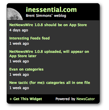
I wondered if the widget design tools were flexible enough for me to create a widget that looked like my weblog. Answer: yes.
Here’s a screenshot, since the actual widget might not make it through your RSS reader.

(You can view the live, running widget.)
My second widget
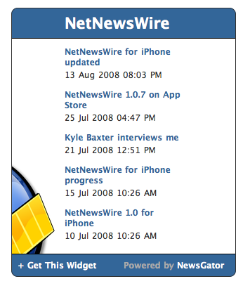
Then I did a widget that people might actually want to spread: it displays the NetNewsWire news feed. Here’s a screenshot:

(Again, the live version is on my widgets page.)
By this time I’d figured out a few things about widget design.
1. Widgets should be in a bordered box of some kind.
Seems obvious, but worth noting. Rounded corners are nearly a must.
2. Widgets are guests on a page. And no part of the widget starts drawing until after the JavaScript include returns.
This said to me that keeping resources low is a good idea. My widgets all use just one graphic. They don’t even use graphics for the rounded corners — they use the support built into Firefox and Safari for rounded corners. (You get square corners on IE, but I was willing to make the trade-off.)
3. The small canvas means keep things simple.
For each widget I used a limited color palette. News items are separated by space rather than with bullets or lines. The one graphic I use adds visual interest plus a clue to what the widget is about. (Business daddy-Os would call the graphic a “branding” thing.)
I could have also added a mini-toolbar for each item, with an email-this link and a place to rate the article. But I didn’t quite buy the workflow, that you’d open a page, read it, and then come back, find the link on the widget, then email or it or rate it. I think you’re going to email a page when you’re actually on the page, either via a link on that page or your browser’s email command. And I didn’t think you’d remember that you want to come back and rate the page. Not including the mini-toolbar meant I had room to display more news items, and the overall look was more clear.
4. There’s a natural layout: title, feed or feeds, and Get This Widget link.
It’s like so many other things — desktop apps, web pages — with a header, main content area, and footer.
To keep things simple (and, I hope, more striking, better able to compete with other things on the page), my headers and footers are always the same background color, and they’re darker than the news items list (the lighter news items list helps with readability).
I’m sure there are more things to know about widget design, but I've only made a few so far, and I haven’t seen them running on other sites yet, so I’m just a newbie.
My third widget
Now I was on a roll — making widgets is fun, it turns out — so I made a multi-feed widget: Seattle Mac & iPhone Developers. Here’s a screenshot:

And I made one last widget with news from the weblogs of some of my co-workers. (I know about the weblogs of J. B. Holston, Greg Reinacker, Jeff Nolan, Karyn German, Walker Fenton, Dan Larson, Nick Harris, and Nick Bradbury. Apologies to anybody whose weblog I don’t know about. ;)
(I’ve already posted enough screenshots — BRENTSCOWRKRSBLOGSOMG appears on my widgets page.)