inessential by Brent Simmons

October 2018

The latest episode of The Omni Show should be of interest to developers — it’s all about building OmniFocus for the Web.

Remember that OmniFocus is a Mac and iOS app written in Objective-C and Swift. The answer for how Omni made it work on the web is the most Omni thing ever. :)

Why Create a Frontier-Inspired Scripting App?

Let me tell you about Frontier.

It still runs (though on its last leg as a 32-bit app), but I’ll talk about in the past tense, because I’m talking about it in its heyday in the ’90s and early 2000s. I was working at UserLand — Dave Winer’s company, which made Frontier — at the time. I was a Frontier enthusiast before I joined the company. It was my dream job.

Frontier began life as a Mac scripting app, before even AppleScript. While it never lost that ability, it turned into a web scripting app around 1995, which is when I first started using it.

In those days — ’90s and early 2000s — Dave Winer invented, collaborated on, popularized, or fleshed-out a number of things we take for granted today: websites created with scripts and templates, weblogs, RSS, RSS readers, podcasting, OPML, and web APIs (XML-RPC).

It was an extraordinary run of creativity. You might just assume that Dave and his team were writing in Perl or Python or similar — but we weren’t. All this work was done in Frontier.

Does the tool matter?

It’s easy to say that the tool doesn’t really matter, that it was all about the people and that particularly fertile time. And it was about that.

But if the tool doesn’t matter, then why do developers care so much about their tools? Tools matter too.

Nothing in my entire career has ever matched Frontier for how it enabled me to make things quickly. Things that are difficult in other environments — persistence, debugging, seeing the results of a script — are so simple in Frontier. It’s just how the app works. It still feels to me like it comes from the future.

The bet I’m making is that there was something special in this design, that this particular tool was capable of unleashing a level of creativity capable of changing the tech world.

What Frontier Was Like

Frontier was a Mac app (yes, there was a Windows port eventually) with an integrated hierarchic database and scripting system.

The key is that it was a Mac app, in the very best sense — it had that old-school Mac philosophy of taking things that were abstruse and difficult and reserved for the priesthood and giving them an easy-to-use GUI. You browse the database and add, edit, and delete values. Everything lives in the database.

Even your scripts live in the database. Open a script in a window, edit it, click Run or Debug, jump to a different script, etc.

The database

Think of the database like a dictionary that could contain dictionaries. We call those tables, but they’re not at all tables in the SQL sense. (Think hash table.) A table can have subtables, and sub-subtables, and so on.

The database holds scripts, outlines, menubars (you can create menus and attach scripts to menu items), styled text, strings, arrays, booleans, numbers of various types, binary data, and more. (Even some things nobody uses anymore, such as QuickDraw rectangles.)

There’s one simple bit of power — it sounds small to say it, but it’s huge: persisting data from a script is as simple as this:

states.Nebraska.capital = "Lincoln"

In the code above, there’s a table named states with a subtable for each state, and it sets the value of capital for Nebraska to “Lincoln.”

Quit and relaunch the app — it’s still there.

Like dictionaries, tables have no schema. You can put anything you want into any table. And of course scripts have full power to create, edit, and delete tables and not just values (the database is fully scriptable — that’s the point).

Scripts

Just as you can refer to database values using dot syntax, a script can call another script the exact same way. In fact, you do that all the time, because the standard library is also stored in the database.

If you call file.readWholeFile(f) — which returns the contents of a file as a string, given the path — you’re actually calling a script readWholeFile that lives in a table named file, which contains the standard library’s file verbs.

And of course that works with your own scripts too. There are no import statements — you just call, using dot syntax, whatever you want to call.

The debugger has the standard things — step into, continue, etc. — and you can view the stack when you debug. The stack is just more tables! Which you can also edit, while you’re debugging, like any other Frontier tables.

And the debugger works across scripts — you can step into a call to another script and continue debugging. (This is super-common, even.)

Your one-off scripts are typically stored in the workspace table. For collections of scripts that work together — as a kind of app — you’d create a “suite” (a table containing scripts and data) or, in later years, you’d put them together in a separate “guest” database.

Getting around was super-easy — if you saw file.readWholeFile in a script, for instance, you’d cmd-double-click it to jump to that location in the database.

Brilliantly, and I think uniquely, scripts were written in an outliner. Scripts are, after all, tree structures — and using an outliner for code folding and reorganizing has huge advantages. It feels surprisingly natural, too. I know how how weird that must sound to anyone who’s never written code that way. But, really, all other code editors seem sad to me in comparison, like reindeer that can’t fly. The outliner spoiled me.

(Tabs vs. spaces was never an issue, at least!)

In the end

It was just so easy to start something, and then refine it and keep going, and make things that did useful things.

We wrote blogging software and RSS readers and all kinds of early open web things. (It even had a built-in webserver.) It was fun — it was a joy, even.

I think the Mac is missing this app. So my goal with Rainier (which is a mess at the moment) is to do a new, modern Mac app inspired by Frontier. It won’t be compatible with Frontier, and lots of details will be different, but I hope to capture that same lightning, which, I think, we could use right now.

I could be wrong! Worst case is that I’ll just get back the fun that I miss so much. Which is okay. :)

PS Somebody somewhere is thinking that this is like a very weird, not-object-oriented Smalltalk. It is! But that doesn’t make it less awesome.

PPS I’ve left out a ton of details, but I hope I’ve gotten the gist of this across.

PPPS If you’re interested in joining the Slack group and helping me with my thinking, just email me. (You can find my email on this page.)

NetNewsWire Article Age Limits

RSS readers — at least the several where I know how they work — have some limits on how long they keep articles and how long they track read/unread status.

I may not have the details exactly right, but I recall that Google Reader stopped tracking read/unread status for every article older than 30 days. With NewsGator it was two weeks or the most recent 200 articles. Older versions of NetNewsWire had different limits, depending on which version you’re talking about.

There are several good reasons for limits. One is ethical: piling up unread articles forever isn’t fair to people. Your RSS reader should not be a taskmaster or a source of guilt. Articles should age out after a period of time.

Another is that the more data is saved, the slower database lookups tend to get, and the slower the app gets. In the case of a Mac or iOS app, this also means using more disk space and more energy (more battery).

A third is that if an RSS reader sets the expectation that it creates a personal backup of the internet, then the developer will be doing features, bug fixes, and performance optimizations for this forever, to the detriment of the rest of the app and the majority of its users. (I went through this with earlier versions of NetNewsWire.)

Limits are a necessity. The hard part is deciding what the limits should be, and figuring out how to make them understandable to users.

NetNewsWire will sync with various systems (Feedbin and similar), and, for each syncing account, it will just adopt the limits of each system.

But that still leaves one case where the limits need to be worked out: the non-synced On My Mac account. The below is my thinking (after much discussion with other people) on this.

The Rule

Articles older than n days will be deleted automatically — but it will preserve a minimum of the 10 most recent articles per feed, and it won’t delete starred items.

(Where n is something like 90 days.)

This is slightly more complex than just aging out older articles. It makes sure that feeds that haven’t been updated in a long time still have their most recent 10 articles.

I think this is reasonable because you don’t want to click on a feed and see zero articles just because it hasn’t been updated in six months (or whatever).

But there’s a tricky part here: how do we define the age of an article? Seems like it should be obvious, but it’s not.

Publication Date vs. Arrival Date

Every article has three dates, though two of them may be empty.

  • Publication date: the date specified in the feed when the article was published (may not exist in the feed)
  • Modification date: the date specified in the feed when the article was edited (may not exist in the feed)
  • Arrival date: the date NetNewsWire first saw the article (guaranteed to exist, since it’s NetNewsWire-generated)

Most of the time, arrival date and publication date will be pretty close. Not always, though — not, for instance, when adding a feed. When it reads a feed for the first time, the arrival date is that moment for each item, while the publication date could be anything.

You might think, naturally, that NetNewsWire should use arrival date when deciding whether or not to delete an article. If it arrived more than n days ago, then it should be deleted, because that means the user has had it for more than n days.

But there’s a problem with that: arrival date is never shown in the user interface. It’s not otherwise an interesting piece of information, where publication date is interesting to users.

So if we have a time-based limit that’s triggered by unseen metadata (arrival date) — and there is visible metadata (publication date) of the exact same type and that seems like it’s directly relevant to age — then I think we have to use the visible date, the publication date.

This makes the limit understandable: you can see the dates, after all, that it uses for its calculation.

(Note: when publication date isn’t specified in the feed, then NetNewsWire uses the arrival date as the publication date, since it will usually be pretty close. Luckily, feeds do tend to include publication dates.)

The one drawback to using publication date, though: it could delete an article with a recent arrival date but a long-ago publication date. I think this is okay — I think it’s the best of the available trade-offs.

The Other Tricky Part: Communicating with the User

The app shouldn’t behave mysteriously. How this works should be clearly communicated.

One option is to just to write about it in the Help book. Unfortunately, people don’t read these all that much.

So here’s what I’m thinking:

Since there will be a preference pane where you can add and edit your various sync accounts (much like in Mail), we have a place for settings for the On My Mac account.

In those settings would be something like this:

Delete articles published more than: [popup] 30 days ago / 90 days ago / 120 days ago

With explanotext:

The On My Mac account deletes older articles when there are more than 10 articles in a feed. It never deletes starred articles.

Though I most definitely like to limit preferences, this is a reasonable thing to want to configure — and having this there makes it much more likely that a user will see it and learn about the limit.

I think that’s the best call, though it’s not set in stone yet.

Reminder: None of This Applies to Syncing

After reading all these words, you might have forgetten that I’m just talking about the limits of the On My Mac account. Different syncing systems have their own limits, and NetNewsWire will adopt those for the synced accounts.

Feedback welcome

If you go to the repo you can find my email address and find the bug tracker. You can always email me to ask to be added to the Slack group. But — fair warning! — a lot of the discussion is over super-dry stuff like this issue.

The Design of NetNewsWire’s Timeline

I had some principles in mind for the timeline:

  • It should be appealing
  • It should include some graphics, to cut down on the wall of text
  • It should be easily scannable
  • It should scroll really, really fast

The last one of those — super-fast scrolling — is important. (High performance is a principle of the app in general.)

Luckily, I’ve written so many timelines over the years that I know how to make them fast. Even on my five-year-old MacBook Air — where I spend about 20% of my coding time — scrolling in the app is as fast as it could be.

So let’s set that aside.

The first one of these — “it should be appealing” — is also super-important. But, as a principle, it’s too general, and the answer is subjective.

So that leaves me with two things to think about: including graphics to cut down on the wall of text, and making it easily scannable. If I do a good job designing those two things, then hopefully the result is just naturally appealing — on the grounds that something well-designed for scannability and legibility tends to be appealing.

(Before I go any further: if you want to go get the app — it’s free and open source — you can.)

What Scannability Means

A timeline cell should have enough info that you can quickly figure out, when you glance at it, what it’s likely to be about, where it comes from, and how old it is.

It should be large enough to be able to include that much context, but not so large that you find you have to scroll constantly (even though scrolling is fast).

It should include the title — hopefully the entire title — and perhaps some of the text, for further context. It should include the feed name so you know where it comes from.

Each cell should be the same height as other cells, since this also helps scannability. (I tried a variable-height table early in the development process, and found that a regular height was better.)

Layout

After trying a bunch of different layouts — my design process often requires me to actually code a thing and try it (for better or worse) — I settled on the following layout:

Title
Title line 2 or first line of body
Date
Feed name

Examples:

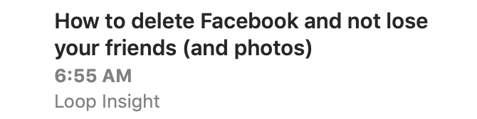
The title is bold and dark, since it should stand out the most. The first line of body text, when displayed, is lighter in color and is regular text.

In the case of a title-less article, the layout is this:

Article text
Article text continued
Date
Feed name

Example:

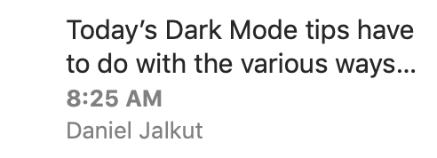
For title-less articles, the article text weight is in between the title and body text. Not as bold as the title, not as light as article text. This tells you, at a glance, that you’re reading the first line of an article and not an actual title.

The date and feed name are set in smaller type. The date is bold, which sets it apart from the article title/text above it and the feed name below it.

All text is ellipsized when needed, which lets you know when you’re not seeing the whole thing.

I decided against horizontal grid lines in favor of vertical spacing. This means less visual noise in an area of the app that could easily be too noisy. And, well, it’s a news reader, not a spreadsheet, and using spacing instead of gridlines seemed more publication-like.

This all might seem obvious. I hope so! Of course it wasn’t obvious — but I like it if it seems that way.

Graphics

I knew I wanted graphics too, in part because they brighten up the UI and keep it from being too text-heavy (and thus hard to scan).

But graphics can serve another purpose: they can quickly tell you something about the article, which helps with scannability.

In NetNewsWire Lite 4.0 I added graphics to the timeline, so this wasn’t a new idea for me. For each article, it looked at the HTML text and found the first image, and assumed it was a featured image. It downloaded those images and made thumbnails to show in the timeline.

This looked pretty cool, brightened up the UI, and cut down on wall-of-text. But it had one major drawback: sometimes the results were a bit risible. Because it was making square thumbnails, it had to crop — which meant sometimes you’d get a nose but no eyes.

And sometimes in trying to find the featured image it would just be a social media sharing icon. Or an image of an emoji. Or a blank tracking image. There was no set of rules that was going to make this work correctly all the time.

And then of course there are plenty of feeds that rarely use images at all. This blog, for instance, or Daring Fireball.

In practice I found that those images — while attractive when they worked — didn’t add that much to scannability (except in the case of photo feeds, which are a minority of feeds, surely).

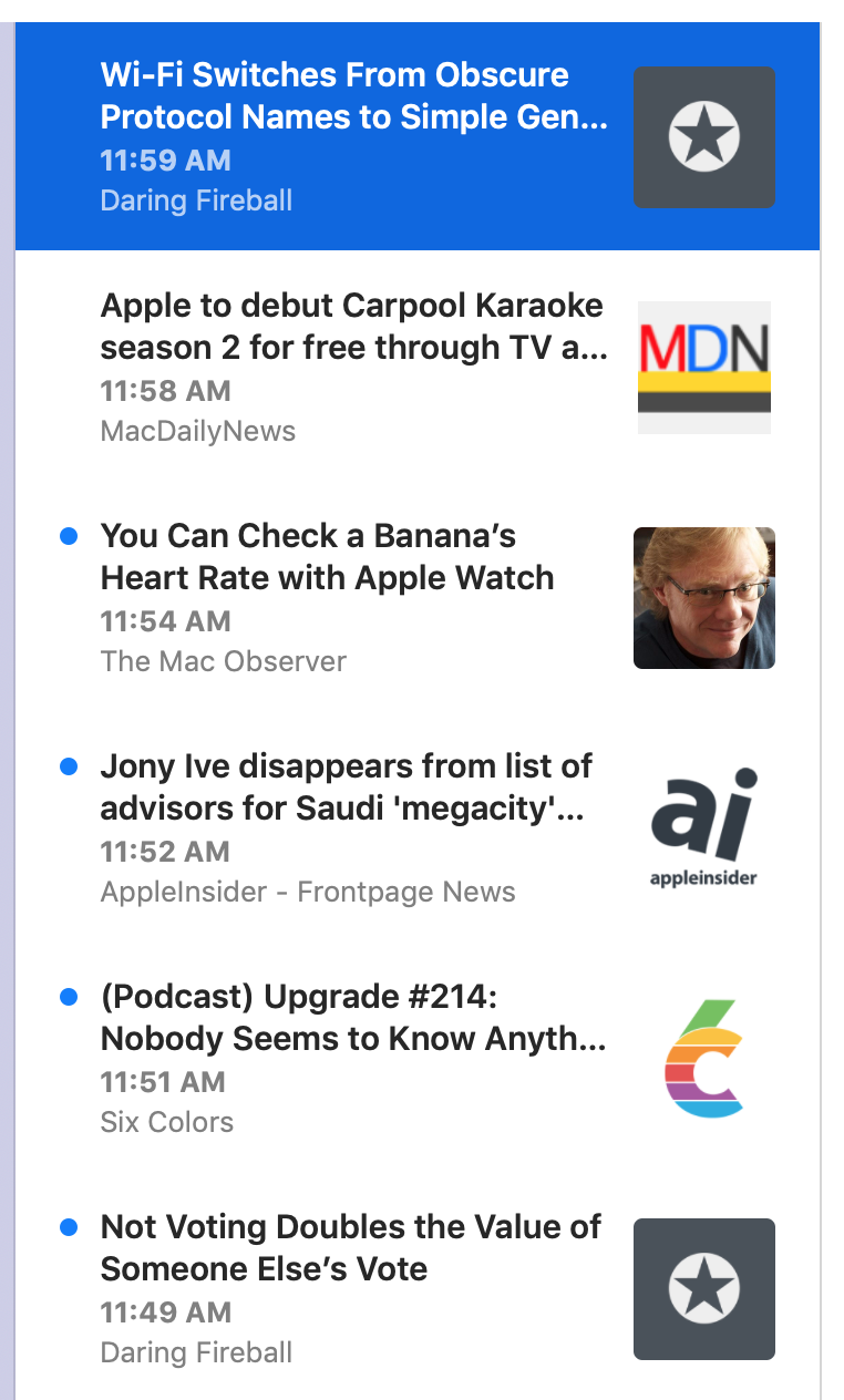
So, for NetNewsWire 5, I decided to go with feed icons. These are like big favicons, basically, and they serve the purpose of providing a super-fast visual indication of which feed an article comes from.

(Finding these is a bit of a chore. There’s a property for this in JSON Feed, but there are plenty of RSS and Atom feeds out there. So, for those, it downloads the HTML for the home page and attempts to find the feed icon by looking at various metadata properties: the apple touch icon, for instance. I’ll write more about the technical side another day.)

Initially I put them on the left side and moved the text to the right. I was thinking of Twitter and chat and similar apps, where the avatar goes on the left.

The problem there, though, was that not every feed has one of these. So I could either leave the left side blank for those feeds, or move the text all the way to the left — but that made it so sometimes the text was indented (when there’s a graphic) and sometimes not, which looked weird.

So I put them on the right — to my surprise, because I never pictured them there — and it works just fine.

Single-feed selection

The above all works great for the Today, All Unread, and Starred pseudo-feeds. It works great when a folder is selected, or when multiple feeds are selected.

But when you have a single feed selected, it looked weird to have the feed name and the feed icon repeated a whole bunch of times.

So, in that case, the layout removes the feed icon and the feed name. The row height becomes correspondingly shorter.

It does mean the timeline is a bit more wall-of-text in this case — but it’s also a quick reminder that the selection is a single feed. I think it’s fine — though I could imagine revisiting this.

Future

I could also revisit the idea of using thumbnails of images from article text. There are problems to solve with that, of course.

One idea would be to put a larger, non-cropped version of the image below the rest of the cell — as you see in Twitter and various unfurls. This would bring back variable-height cells, but that’s not necessarily the worst thing. (People deal with variable heights just fine in social media apps.)

Another idea for the timeline — one I’m pretty keen on — is to render microblog posts in full in the timeline. (Microblog in the generic sense, not just posts from Micro.blog.) These would have to include clickable links and basic HTML formatting.

The thing is, I don’t want to just use a web view. To make this work well would mean writing a small HTML layout engine that handles the basics (bold, italics, links, blockquotes, images). While this sounds like a fun challenge, it’s also probably not a one-day project. It would take some time. And right now I’ve got enough other things — syncing, especially — to do, so I’ve put off thinking about this until after 5.0 ships.

Another thing put off until after 5.0 ships: an alternate high-density timeline. I’ve heard from a number of people that they really prefer one-line cells with multiple columns: title, date, feed name. For them this is the most scannable UI, and they liked this exact feature in years-ago versions of NetNewsWire. So it’s something to consider — but, again, I’m not thinking about it till after 5.0 ships.

Dark Mode

Though I don’t run in Dark Mode normally — even though it’s beautiful — sometimes I switch to it just to look at NetNewsWire. :)