The Design of NetNewsWire’s Timeline
I had some principles in mind for the timeline:
- It should be appealing
- It should include some graphics, to cut down on the wall of text
- It should be easily scannable
- It should scroll really, really fast
The last one of those — super-fast scrolling — is important. (High performance is a principle of the app in general.)
Luckily, I’ve written so many timelines over the years that I know how to make them fast. Even on my five-year-old MacBook Air — where I spend about 20% of my coding time — scrolling in the app is as fast as it could be.
So let’s set that aside.
The first one of these — “it should be appealing” — is also super-important. But, as a principle, it’s too general, and the answer is subjective.
So that leaves me with two things to think about: including graphics to cut down on the wall of text, and making it easily scannable. If I do a good job designing those two things, then hopefully the result is just naturally appealing — on the grounds that something well-designed for scannability and legibility tends to be appealing.
(Before I go any further: if you want to go get the app — it’s free and open source — you can.)
What Scannability Means
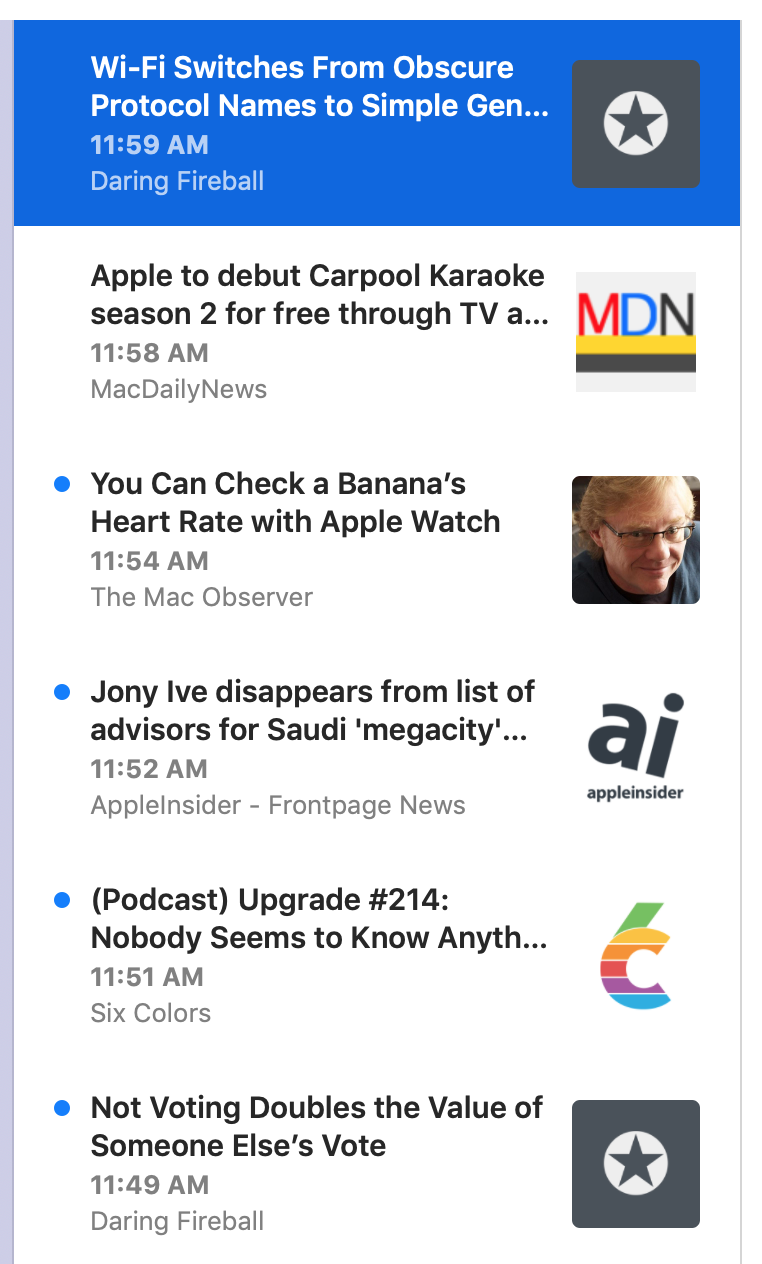
A timeline cell should have enough info that you can quickly figure out, when you glance at it, what it’s likely to be about, where it comes from, and how old it is.
It should be large enough to be able to include that much context, but not so large that you find you have to scroll constantly (even though scrolling is fast).
It should include the title — hopefully the entire title — and perhaps some of the text, for further context. It should include the feed name so you know where it comes from.
Each cell should be the same height as other cells, since this also helps scannability. (I tried a variable-height table early in the development process, and found that a regular height was better.)
Layout
After trying a bunch of different layouts — my design process often requires me to actually code a thing and try it (for better or worse) — I settled on the following layout:
Title
Title line 2 or first line of body
Date
Feed name
Examples:


The title is bold and dark, since it should stand out the most. The first line of body text, when displayed, is lighter in color and is regular text.
In the case of a title-less article, the layout is this:
Article text
Article text continued
Date
Feed name
Example:

For title-less articles, the article text weight is in between the title and body text. Not as bold as the title, not as light as article text. This tells you, at a glance, that you’re reading the first line of an article and not an actual title.
The date and feed name are set in smaller type. The date is bold, which sets it apart from the article title/text above it and the feed name below it.
All text is ellipsized when needed, which lets you know when you’re not seeing the whole thing.
I decided against horizontal grid lines in favor of vertical spacing. This means less visual noise in an area of the app that could easily be too noisy. And, well, it’s a news reader, not a spreadsheet, and using spacing instead of gridlines seemed more publication-like.
This all might seem obvious. I hope so! Of course it wasn’t obvious — but I like it if it seems that way.
Graphics
I knew I wanted graphics too, in part because they brighten up the UI and keep it from being too text-heavy (and thus hard to scan).
But graphics can serve another purpose: they can quickly tell you something about the article, which helps with scannability.
In NetNewsWire Lite 4.0 I added graphics to the timeline, so this wasn’t a new idea for me. For each article, it looked at the HTML text and found the first image, and assumed it was a featured image. It downloaded those images and made thumbnails to show in the timeline.
This looked pretty cool, brightened up the UI, and cut down on wall-of-text. But it had one major drawback: sometimes the results were a bit risible. Because it was making square thumbnails, it had to crop — which meant sometimes you’d get a nose but no eyes.
And sometimes in trying to find the featured image it would just be a social media sharing icon. Or an image of an emoji. Or a blank tracking image. There was no set of rules that was going to make this work correctly all the time.
And then of course there are plenty of feeds that rarely use images at all. This blog, for instance, or Daring Fireball.
In practice I found that those images — while attractive when they worked — didn’t add that much to scannability (except in the case of photo feeds, which are a minority of feeds, surely).
So, for NetNewsWire 5, I decided to go with feed icons. These are like big favicons, basically, and they serve the purpose of providing a super-fast visual indication of which feed an article comes from.
(Finding these is a bit of a chore. There’s a property for this in JSON Feed, but there are plenty of RSS and Atom feeds out there. So, for those, it downloads the HTML for the home page and attempts to find the feed icon by looking at various metadata properties: the apple touch icon, for instance. I’ll write more about the technical side another day.)
Initially I put them on the left side and moved the text to the right. I was thinking of Twitter and chat and similar apps, where the avatar goes on the left.
The problem there, though, was that not every feed has one of these. So I could either leave the left side blank for those feeds, or move the text all the way to the left — but that made it so sometimes the text was indented (when there’s a graphic) and sometimes not, which looked weird.
So I put them on the right — to my surprise, because I never pictured them there — and it works just fine.

Single-feed selection
The above all works great for the Today, All Unread, and Starred pseudo-feeds. It works great when a folder is selected, or when multiple feeds are selected.
But when you have a single feed selected, it looked weird to have the feed name and the feed icon repeated a whole bunch of times.
So, in that case, the layout removes the feed icon and the feed name. The row height becomes correspondingly shorter.
It does mean the timeline is a bit more wall-of-text in this case — but it’s also a quick reminder that the selection is a single feed. I think it’s fine — though I could imagine revisiting this.
Future
I could also revisit the idea of using thumbnails of images from article text. There are problems to solve with that, of course.
One idea would be to put a larger, non-cropped version of the image below the rest of the cell — as you see in Twitter and various unfurls. This would bring back variable-height cells, but that’s not necessarily the worst thing. (People deal with variable heights just fine in social media apps.)
Another idea for the timeline — one I’m pretty keen on — is to render microblog posts in full in the timeline. (Microblog in the generic sense, not just posts from Micro.blog.) These would have to include clickable links and basic HTML formatting.
The thing is, I don’t want to just use a web view. To make this work well would mean writing a small HTML layout engine that handles the basics (bold, italics, links, blockquotes, images). While this sounds like a fun challenge, it’s also probably not a one-day project. It would take some time. And right now I’ve got enough other things — syncing, especially — to do, so I’ve put off thinking about this until after 5.0 ships.
Another thing put off until after 5.0 ships: an alternate high-density timeline. I’ve heard from a number of people that they really prefer one-line cells with multiple columns: title, date, feed name. For them this is the most scannable UI, and they liked this exact feature in years-ago versions of NetNewsWire. So it’s something to consider — but, again, I’m not thinking about it till after 5.0 ships.
Dark Mode
Though I don’t run in Dark Mode normally — even though it’s beautiful — sometimes I switch to it just to look at NetNewsWire. :)
