That About Wraps It Up for Stock Mac UI
The latest macOS is a nice step toward a good-looking Mac UI, but I do wish it had gone farther.
I am in particular not a fan of how Mac toolbars look. I don’t like the full-height sidebars and I especially don’t like the Liquid Glass buttons.
I looked around at what other Mac apps are doing. I asked on my microblog which gets syndicated to Mastodon and I also looked at replies to Isaiah’s similar question from a few days ago.
What I found should be no surprise: many of the apps people think look good are not using stock UI.
You already know this. I don’t think I need to prove it. But one app may serve as an illustration: Things.
Things is a perennial callout for its design and for its Mac-like-ness. But it is not really a stock Mac app at all. The toolbar is not at the top of the window (not an NSToolbar) and it’s not customizable. There is no hint of Liquid Glass style translucency anywhere in their main UI. The content doesn’t slide under the sidebar, for instance. (The one place I can find anything obviously Liquid Glass is the toolbar buttons in the settings window.)
I’ve long been a devoted proponent of using stock Mac UI for, I always thought, good reasons: users are already familiar with that UI and it’s less work to create and update every year.
Plot twist
I think those reasons (user familiarity and developer effort) may not stand up entirely. At least not these days.
Users have shown — again, I don’t need to prove this — that they don’t think about a stock Mac app vs. custom. Do they dislike Things for not having a toolbar at the top of the window that they can customize in the usual way? No. (The only people who think that way are longtime Mac developers like me.)
Are users able to understand the UI to popular Mac apps — to Things, Slack, Craft, OmniFocus, NotePlan, Bear, Reeder, Telegram, Acorn, Tapestry, Obsidian, Audio Hijack, etc. — without much trouble, no matter how stock or not-stock they are? Yes.
Do they know when an app is an Electron app? Nope: they don’t even have a concept of Electron apps and they wouldn’t care if you explained it to them. (Why should they?)
Users may be already familiar with stock Mac UI (and maybe not, actually, depending on what apps they use) — but I don’t think that matters at all anymore.
So what about developer effort
The idea was that by using stock Mac UI you the developer would be carried along — you’d get most of the macOS changes every year mostly for free or with not that much work, since you’d kept up every year.
But my app NetNewsWire has a very stock Mac UI, and Liquid Glass adoption last year was a lot of work. Using stock Mac UI didn’t save us much — in fact, we had more work to do compared to the apps with more custom UI.
I’ll go back to Things. I’m not picking on them, to be clear. Quite the opposite! I very much respect their work, even though I have in the past wished it were more Mac-like (again, in the way only a longtime Mac developer would).
Here’s their blog post from a year ago on adopting Liquid Glass. They did some work, for sure, at their usual high level of quality. And I’m not denigrating that. But it looks like a lot less work than we had to do on NetNewsWire.
And that’s my point: the level of developer effort was higher for the stock Mac app.
The secret third reason for using stock Mac UI
To recap: the reasons for using stock Mac UI are 1) user familiarity, which we’ve known for a while just isn’t a thing, and 2) hoping to be able to expend less developer effort, which we’ve seen can work against you.
But there’s another reason: the stock Mac UI is designed by Apple, the best designers in the world, and do you really think you can do better? Really?
The app world is full of people who think they’re better and they’re really, really, really not.
Well, I still think Apple has the best collection of UI designers in the world, but, for whatever reasons, the guidance from above on how the Mac UI should look is missing the mark. I’m not blaming the people doing the work — they’re doing great work with the direction they’re given.
So this — bad direction — is where the secret third reason falls down. And we’re left with no real reason to stick with stock Mac UI (except for wanting approval from longtime Mac people like me, and you really shouldn’t care about that at all).
Messing around last night
With this in mind I wondered how far I could get in removing the parts of Liquid Glass I don’t like in NetNewsWire. Turns out I could get pretty far, though it comes at the expense of using NSToolbar (as predicted).
Note: this stuff is just on a branch. One night of play, not real design or consideration. (But this is code, not mockups.) It’s not about to ship this way. But I’ll share anyway, because it does hint at some possible ideas for NetNewsWire’s future.
Click the small version to get the big version.
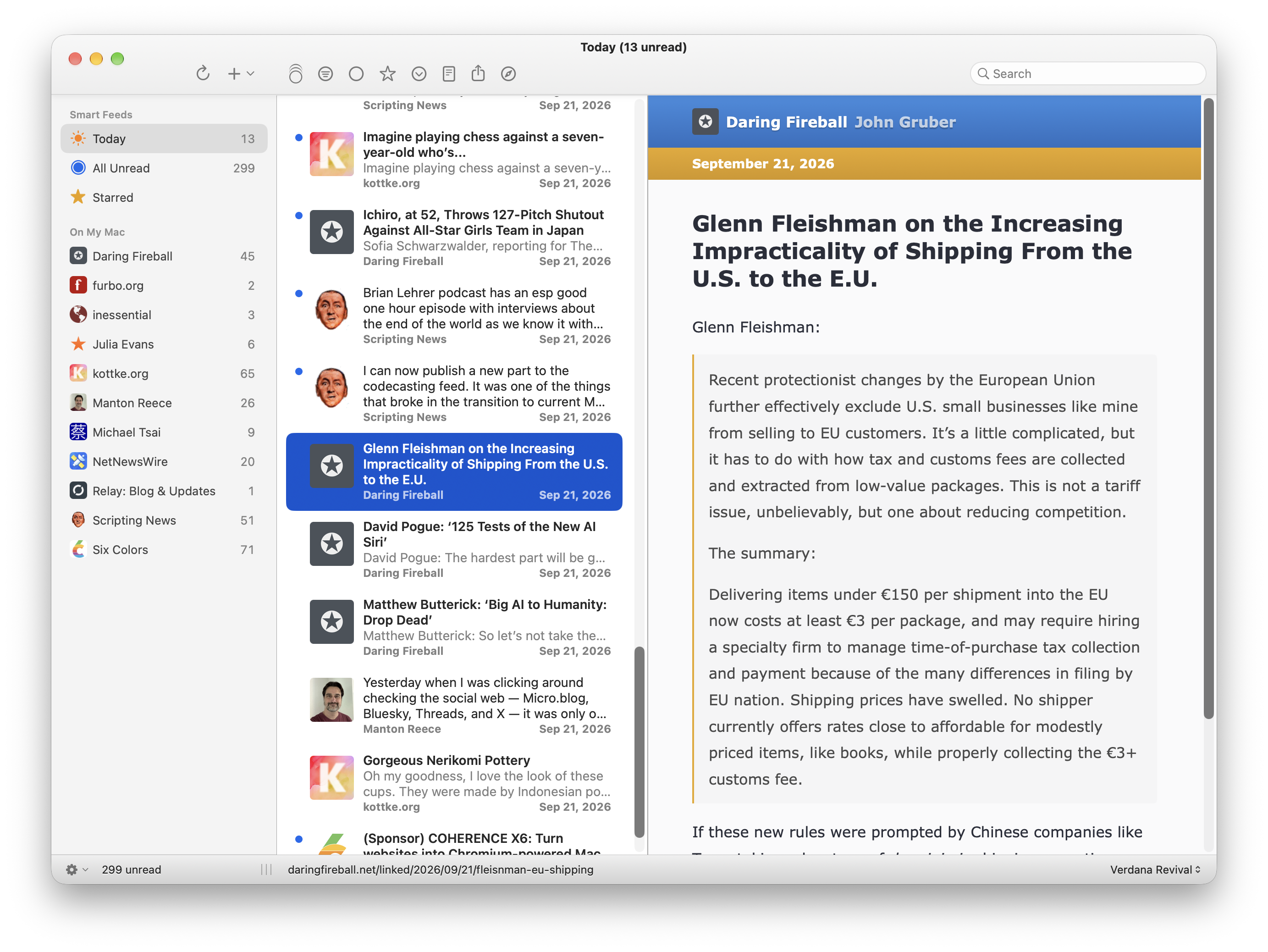
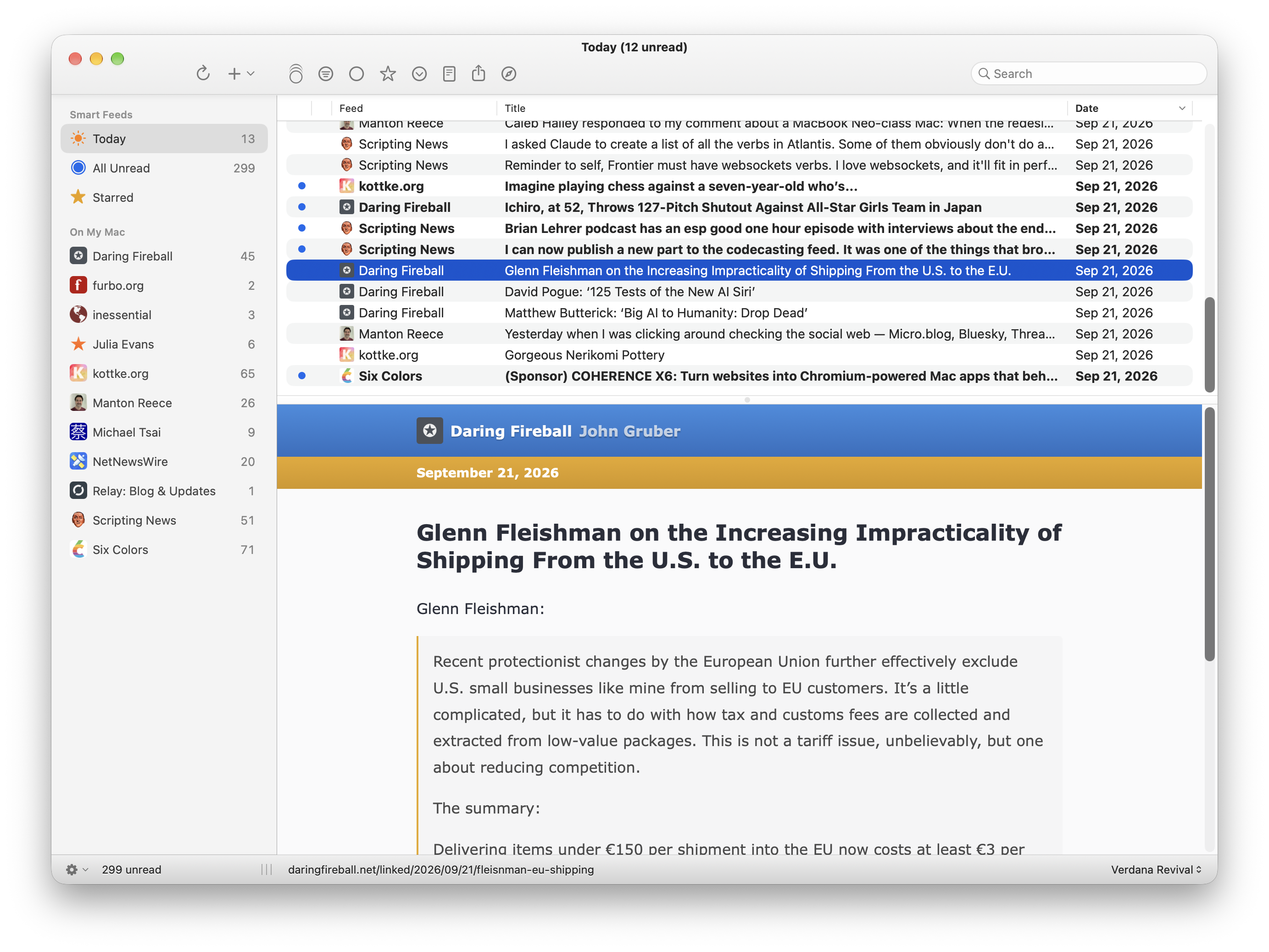
(Note that the column view in the second screenshot is going to ship in 7.2. That part’s already done, and it has nothing to do with Liquid-Glass-or-not. Also note: the article theme in use is part of the standard NetNewsWire app right now, not a new thing.)
The obvious first best thing I could do to improve this is to add some color to the toolbar icons and spread them out better. Maybe add some ability to customize, even though it’s not a standard Mac toolbar.
Of course you might look at this and think “Blech! Looks so old! Spare me!” Totally fair!
But it felt cute. Might delete later