The new Combined View and hybrid web/desktop apps
The new Combined View—I’m tempted to call it a bug fix rather than a new feature. The performance bug (and some sizing bugs) couldn’t be fixed with the old version. This was a case where only a complete re-write would fix the problems.
To re-iterate... the problem was that each item had its own separate webview, which meant tons of overhead. If you had 100 news items displayed, that was literally the same as having 100 small web pages open all at once.
So the obvious choice was to make it one big webview—a single web page—to get rid of that overhead.
But then there’s a whole other challenge: how do you make it so that you can still navigate with the keyboard? How do you have the concept of a selected item? It can’t just be the same as an online reader—it needs to have the features desktop app users expect.
The key to the whole thing is JavaScript. When something happens in the page—you click on a news item, for instance—the page calls back into the app, and the app tells the page how to update.
It’s kind of like Ajax in that way, except that the communication channel is not http and it’s synchronous (which it can be, since it’s right there on your machine).
Similarly, if you choose a menu item or click a toolbar button (such as Mark All As Read), then the app calls into the page to run some JavaScript. It doesn’t have to generate a new page—it just changes some classes, swaps some images, whatever it needs to do.
I’ve found that being able to do this two-way communication—page-to-app and app-to-page—allows for all kinds of clever stuff. You can add some nice touches. For instance, check out these two details:

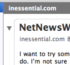
In the first detail, the Combined View has focus. In the second, the subscriptions list has focus. (The Combined View also dims when the app is no longer frontmost.)
To get the dimming effect, the app calls into the page to tell it it’s inactive. The page then uses JavaScript to swap some CSS classes, which changes the display.
Anyway, I liked working this way enough (getting to exercise my JavaScript, HTML, and CSS chops) that I also did the same thing for the new Attention Reports feature. (Lifted straight from FeedDemon, by the way.) Those are also HTML pages—but with rollovers and all that. And when you click an unsubscribe button, it calls into the app, and the app displays the standard unsubscribe sheet.
This is all definitely a benefit of WebKit—it makes possible this kind of hybrid, a mix of desktop and web technologies. I feel like I’ve only scratched the surface.
PS In the screenshot above, how did I get the rounded corners in the current selection? CSS, plus four little graphics for the round corners. I’m not drawing on top of a webview or anything nutty like that—it’s pure CSS.
PPS The old Combined View—one item gets one webview—sounds bizarre. Why would I have done that in the first place? Well, the Combined View actually came before WebKit. Originally, each item was a separate NSTextView—recall that NSTextView had (probably still has) some basic HTML display. This was much, much faster than using WebKit webviews, mainly because the HTML feature in NSTextView was so very basic. Once WebKit came out, the natural thing was to switch from NSTextViews to WebViews. That’s how it ended up being the way it was.
PPPS I’m partitioning the hard drive on my laptop and re-installing OS X so I have a place to install Leopard (assuming we get Leopard disks at WWDC). Hence all the writing tonight. ;)