On the design of the first-run assistant
Instead we went with a native window, with real Mac controls and all that good stuff.
Normally this is kind of a boring thing—not one of the exciting features, not necessarily worth discussing. But since this is an example of a hybrid app with an online component, I thought it might be interesting to other developers of hybrid apps.
I’m not holding it up as a work of art or even an example of best practices—it’s just some notes from a practitioner.
(NetNewsWire users might find this interesting too, but this post is intended for other Mac developers. Non-programmers might also find it interesting, or insane, to see how much thought goes into what looks like straightforward, no-brainer user interface.)
The goals of the first-run assistant
We decided to do a few things:
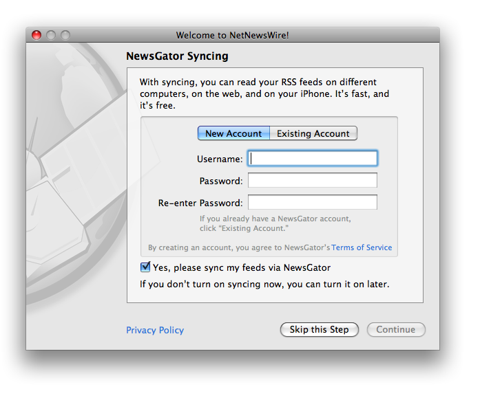
1. Make it so you can create an account or enter your info for an existing account. Or not create an account if you don’t want to.
2. Turn on NewsGator syncing. Include some text about why syncing is cool.
3. Link to the privacy policy and terms of service.
4. Ask for email address, with checkbox for okay-to-send-email or not.
5. Present as little friction as possible—don’t overwhelm the new user so that he quits without trying the app. Ask for just the minimum required to make an account: username and password.
What it looks like
Here’s a screenshot. (Note: you can open the window yourself. Type cmd-option-shift-4. I left in this testing code because I knew I’d be writing this weblog post. ;)
The first thing to notice is that it looks like other Mac OS X assistants. For instance, launch /Applications/Utilities/Boot Camp Assistant, and you’ll see that it looks similar. (This makes a huge difference, by the way. Check out the original draft of this window. Ugh. Not good.)
Another thing is that it’s not modal—you can close the window with cmd-W. NetNewsWire runs in non-synced mode, and no NewsGator account is created. That won’t be appropriate for every hybrid app, but in this case we could do it.
The syncing pitch
When you want to pitch a feature, there’s always a tension between saying too much and too little. You need to say enough to make it enticing, but not so much that people’s eyes glaze over. In practice, in this context, that means one or two sentences.
I could write many paragraphs talking about why syncing is cool and what the benefits are. But I had to compress it.
The original mockup read, “With NewsGator syncing, you can read your RSS feeds on different computers and on your iPhone. It’s free.”
The final version reads, “With syncing, you can read your RSS feeds on different computers, on the web, and on your iPhone. It’s fast, and it’s free.”
The original version was cool because it assumes you have an iPhone. ;) And if you don’t have one, we’ve kind of flattered you, since we know you’re the kind of person who’s going to get an iPhone. It also spells out what is my personal favorite benefit of syncing. (iPhone reading!)
But the original version didn’t make it explicit that there’s an online reader. So I added the “on the web” bit. It’s one of those phrases where you know what it means (browser-based reader) even though it’s not explicit. (It could have been more explicit, but at the cost of more words and, hence, the more potential for the eyes-glaze-over effect.)
I also added the “It’s fast” part as a result of collaborating with Nick F. Bradbury and Nick F. Harris—they both thought that talking about performance was important, and I agreed. (We passed around mockups and critiques, and our first-run assistants are similar, though not exactly the same. It was quite fun, actually. I don’t often collaborate on UI that way.)
The “it’s free” part is, of course, totally critical. It’s entirely possible that some NetNewsWire users would get to this part and think that we’re selling a service on top of the free NetNewsWire. So we had to be explicit that the syncing is free too.
Two sentences, and we’ve listed the main benefits, mentioned the magic word iPhone, and took away any nervousness about being charged for something.
It’s important, by the way, that “it’s free” be last—since the last thing in a sentence is emphasized, and since the free-ness is, human nature being human nature, the thing most likely to entice people to try it. People love free.
The account box
In my original mockup, it didn’t distinguish between new and existing account. The idea was to keep it simple: if you enter account info that didn’t exist, we’d create an account. If it did exist, it was an existing account.
But this idea had a major drawback: what if you typed in an existing username but the wrong password? Is that a new account or existing account? No way to know.
So I added a segmented control to switch between the two. Also, since people may have been confused about that control (or might just filter it out), I added some of that note-text-in-gray that made it explicit. “If you already have a NewsGator account, click ‘Existing Account.’” (There’s a similar line of text for if you have clicked on Existing Account.)
I didn’t really want to add more words—more friction, more eyes-glaze-over bits—but I think it’s okay.
I went around for a while on whether or not the new/existing-account section should be in a box or not. Finally I went with the box. Even though it was more, visually, I think it turned out more clear to have this section grouped.
Goddamn links-as-UI
Here’s something I hate from Windows—the use of links as UI elements outside of HTML views.
But I did it in two places: the link to Terms of Service and the Privacy Policy. When it actually means, “Click here to open a page in your browser,” I think it’s okay. (If it means anything else, then it should be some other kind of button.)
Anyone writing a hybrid app will, most likely, have reasons to call out to a web page. There may be better ways for specific cases, but in the general case, link-as-UI isn’t awful, if kept to this specific meaning.
I went around a little bit on whether or not to underline the links. They looked like crap when underlined—it made the window look busier. But I was concerned that it might not be clear that they are, in fact, links.
Since I’m a Mac guy, I went without the underlining. ;)
(By the way, they’re just NSButtons.)
The syncing checkbox
The please-sync checkbox is checked by default—but syncing is not really turned on unless you do actually create a new account or enter info for an existing account. I was afraid this might be a source of confusion, but I think it’s intuitive, works like you’d expect.
First-run assistants are all about reducing anxiety. One obvious source of anxiety would be wondering if this is your one shot to set up syncing. It’s not, of course, so we say, “If you don’t turn on syncing now, you can turn it on later.”
In some earlier versions of this window we tell you how to turn on syncing later: open the Preferences and click the Syncing toolbar button. But that’s more words, and words mean more anxiety and glazed eyes—and I figured nobody would remember the instructions anyway. It’s enough to communicate that simple boolean: YES, you can turn it on later if you want to. Anxiety reduced, and not even the anxiety of trying to remember instructions.
You know what? There’s a lot of stuff going on in this window. But it works.
Skip this Step
Since creating an account is optional, we needed a way to skip it. I couldn’t rely on people being aware that they could just close the window, so there’s a Skip this Step button. You end up with this:
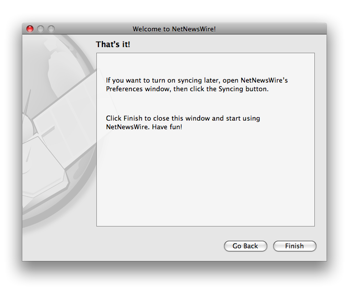
Here I do actually say how to turn it on later, even though nobody would remember the instructions. It communicates that it’s easy (the instructions aren’t long)—and it would have seemed chintzy and weird not put the instructions there, given all the space.
The most important thing here is that you realize you’re finished, you’ve done it, you can go use the app and have fun now.
Create account
What if you created an account and turned on syncing—here’s what you see:
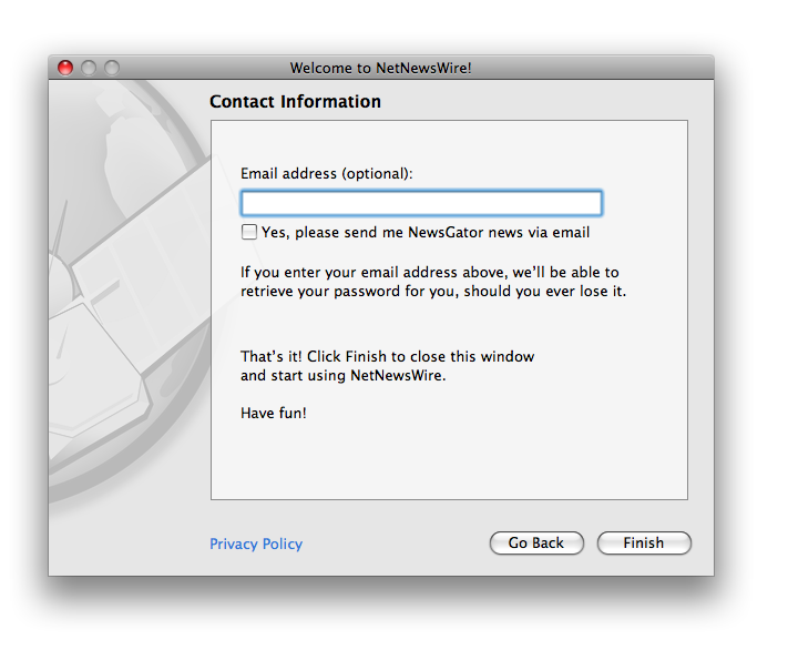
Here we actually ask for your email address and ask if we can send you news via email. We make it clear that it’s optional, and the send-news checkbox is unchecked by default. We also tell you a benefit of typing in your email address.
When this came up in the meeting, the developers were adamant that the less we ask for, the better— we don’t want people to bail during the setup process. But other folks did want to ask for the email address for the standard reasons.
Is it funny for an RSS company to ask if we can send you news via email?
I’m like, okay, can do, but I want to blog about it. ;)
So this ended up being my favorite part of the assistant, just because of what it says about the business of the web. Everybody asks for your email address, no matter what. Even RSS companies. (Greg Reinacker reminded me how Coda brings up a thing about a mailing list. I consider it a good sign when NewsGator folks give me the What Would Panic Do? line. ;)
That’s it! Have fun!
Again, this page makes it clear that you’re finished. Once you click Finish, you get another window which starts the first-sync process and may give you some options. But you’re off and running at this point.
Small technical point: the email address gets sent to the server in the background—it doesn’t block anything. The window disappears immediately. There was no need to keep the window around, display a progress indicator, or anything like that.
Here’s something I didn’t do: OPML import. I think both Inbox and FeedDemon have that as part of the first-run process, but I felt like it was too much here. It’s a platform difference, I think: Windows users are used to longer installation processes, while Mac users expect to double-click and go. It’s a tough call, because OPML importing would have made sense here. (Email apps, for instance, may prompt you to import email from another app.) But I wanted to get as close to double-click-and-go as I could, and decided not to do OPML import here.
That’s it! This post is over! Have fun reading something else!
P.S.
The window background was made using Acorn.