NetNewsWire 3.2b6 - public beta

The public beta of NetNewsWire 3.2b6 is on nnwbeta.com. Includes Google Reader syncing, send to Instapaper, and a new app icon.
The public beta of NetNewsWire 3.2b6 is on nnwbeta.com. Includes Google Reader syncing, send to Instapaper, and a new app icon.
“Oh, it’s easy, just a quick http call. I could write a script to do it in like 20 seconds.”
I recently added a pretty easy feature to NetNewsWire — a Send to Instapaper command. (It will appear in 3.2.)
It really is just a quick http call to the Instapaper server to add a URL to the Read Later list.
Piece of cake.
But of course it’s not as simple as just writing a quick script. It’s tempting to think that adding a feature like this is just about adding the functionality — but there’s a bunch more to it than that.
It’s not enough just to write the basic functionality and add a menu item that runs it. Even a feature as simple as this one requires some up-front thinking, some design.
This would complicate the feature. Each time you post you’d have to choose the account (if you have more than one).
And we’d have to include some UI for creating, adding, deleting, and editing your Instapaper accounts, which would require a whole new screen, probably in the Preferences window.
I’m willing to bet that most people who use Instapaper use just one account, or at least are willing to use just one account when saving from NetNewsWire. So I decided that support for multiple accounts was not nearly worth it.
But!
While a person may have just one account, they might change that one account some day. So I had to have a way to change your Instapaper credentials. I already knew I’d have a menu item — I took the simple way of adding an alternate item (that appears when you hold down the option key) for switching your Instapaper account, so you can enter new credentials.
I don’t necessarily love this, because it can be hard to discover — and sure as shootin’ I’ll get questions about it, even if it’s in the Help book — but at least the capability would be there for the rare times it’s needed.
Tough call. I decided no for 3.2, but yes for 4.0.
Toolbar items need artwork, and artwork doesn’t grow on trees: they cost money and time, and I’m on a tight schedule.
But still, this was a tough one, because I know there are users who barely look at menus. If a command is not in the window, they won’t know about it. To make things worse, even if I made the send-to-Instapaper command a default member of the toolbar, anybody who’d previously customized their toolbar wouldn’t see it. And they wouldn’t necessarily think to check if the toolbar has any new items with the new release.
Discovery is always an issue. And there are two types of feedback:
“I don’t know why you put that in my face — I’ll never use it.”
And…
“I don’t know why you buried that feature!”
If you’re offline or the Instapaper server is down (not that I’ve heard of it going down), and you choose Send to Instapaper, what should happen?
If it works like syncing, then it would try to contact the server, but if it fails, it would remember and keep trying later until it succeeds. Even across runs of the app.
If I did that, I’d have to:
Add a persistent list (using a database, property list, Core Data, something) to remember URLs that need to be re-tried.
Add code that keeps trying to send items from the list.
More importantly, I’d have to deal with the following user experience:
User does a send-to-Instapaper from within NetNewsWire.
The call fails for some reason and is queued up, to be re-tried later.
User goes to their Instapaper Read Later list and does not see the item they remember adding. User goes, “Whisky! Tango! Foxtrot!”; user is, quite rightly, less than happy.
There would have to be some kind of UI for dealing with this. It could be as easy as notifying the user that the call failed but would be re-tried — but, worse, I suspected that a way to view the queue would also be needed.
Which meant, probably, a new window with a table diplaying the queue, and another menu command to open the queue. And probably buttons for deleting items from the queue, and maybe a button to re-try all right away, and maybe some more info about the failures (the reason why the requests are queued). And there would probably have to be some indication in the main window that there are requests in the queue.
Totally not worth it.
The experience of most Instapaper users is with using a bookmarklet: they know that it won’t work if off-line, and they know that it tries once, right away. Given that, I could make it easy and do what current Instapaper users already expect: try the call, and if it fails, present an error message to the user.
The easy and obvious answer is to display a username and password sheet if you choose the command and haven’t entered credentials before. Because Instapaper has some special requirements, this couldn’t be a generic username/password sheet (one where I just update the text before displaying) — it needed its own sheet.
This feature is different from the send-to-weblog, send-to-delicious, etc. features in that no more action is required after choosing the command. (Once you’ve entered credentials the first time, that is.)
Since NetNewsWire has a status bar, I decided that that’s the place for feedback: a spinning progress indicator and some “Sending to Instapaper…” text.
You’ll note that this got revisited later.
While thinking about all of the above, I actually wrote the simple little code that actually sends the URL to Instapaper. I barely remember doing it. It was a piece of cake.
My theory: anyone who needs to be able to send multiple items with one call is somebody who’s using Instapaper as storage rather than as a to-read-later list. I figured this wouldn’t be an issue for most people.
Consider the UI implications of partial success: say, for whatever reason, 3 out of 7 calls failed. How do you notify the user? It gets complicated and un-fun at this point.
So, no, just one item at a time.
After all this, “Now vee may perhaps to begin.”
I put the Send to Instapaper menu item in the News menu, next to similar items. Added the alternate Switch Instapaper Account… menu item. I gave the menu item a keyboard shortcut.
The next step was to validate the menu item: it should be enabled only when there’s a single selected news item or an open web page.
But, of course, that’s not enough — there is also the issue of contextual menus. There are several contextual menus where it was added:
News items table.
News item description.
Tab.
Web page open in tab.
This part was the easy part. Just a quick NSURL* thing. Cake.
There is more error handling code than the code to actually call the server. It’s necessary to handle random connection difficulties, 403 authentication errors, bad-request errors, and so on. Any time an app makes an http call, all kinds of things can go wrong.
For example, if the server returns a 403, then it’s necessary to ask the user for credentials. Even if they’ve entered them before.
There’s a special authentication sheet for posting to Instapaper. And a special window controller just for that sheet. Again, there’s more code there than for the http call itself.
Even just the code to get and set the password in the keychain is longer than the actual http-call code.
When I first sent this to private beta testers, they liked the feature, but thought it should have some kind of feedback.
Well, of course there was feedback — some text and a spinning progress indicator in the status bar. But, unsurprisingly, people didn’t notice it.
I thought to myself, “You know, 10 years ago, that would have been fine. It would have been the right thing to do, to use the status bar.”
And I wondered why that was no longer true. The answer, I think, is monitor size. With bigger displays people create bigger windows, and it’s much less likely they’ll notice something in the status bar, since the status bar is so much farther away from where their focus is.
I went back to the drawing board and did a little popup window. My first quick version just had the Instapaper icon and a spinning progress indicator. I figured I’d add some “Adding to Instapaper…” text of some kind to it.
The code behind the feedback window is, again, bigger than the http-call code. (By now you’ve gotten the idea that the core functionality of a feature is often the very smallest part.)
When I first saw the feedback window in action, it happened so quickly that I realized it doesn’t need a “Posting to Instapaper…” message on it. In fact, that would have been a bad idea, since it happens so quickly you don’t even have time to read any words. So I left it at just an icon and a spinning progress indicator.
A reasonable question you might ask: why not just use Growl?
Two reasons.
Not everyone has Growl.
You want feedback to appear immediately — you want to know that something is happening right away, and you want to see that it’s continuing to happen. You don’t want to wait for a Growl notification.
And it’s nice that the feedback is similar to how the send-to-Instapaper bookmarklet works, so it will feel familiar to Instapaper users.
Private testers eventually got the new version with the feedback window, and I don’t have any bug reports. But of course I do have feature requests to implement all the things I decided not to do or to leave for later. Plus more things — an entire Instapaper treatment, even, with the ability to see your reading lists in NetNewsWire and create groups and so on.
Applying the 80/20 rule means you will get feature requests from the 20. (And beta testers are often power users, and they’re more likely to want those extra powerful features.)
But, in the end, this was an easy and small feature.
 I was a moron five years ago. Five months ago, even.
I’ve heard this from other programmers, so I don’t think I’m alone. They look back at old code they wrote and say, “What idiot wrote this crap?”
I used to wonder if this feeling would ever go away — as if I’d just get to the point where I’m super-awesome and that’s it.
But over the years I’ve learned to rely on this feeling. Were it ever to go away, then I’d be worried like hell. It would mean I’m not learning and not improving.
So, yes, I’m proud to have been such a moron so recently.
I’m using Disqus for the comments system here. I moderate all comments. This is only the second comment I’ve turned down. (The first one was only semi-jerky.)
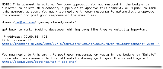
This hasn’t happened to me in a little while, so I don’t think I’ll hurt anyone’s feelings by bringing it up. (I hope not. I don’t intend to.)
I bet every Mac and iPhone developer (and probably some Windows developers too) has heard this at least once, if not dozens of times, from someone who uses their software: “I will PayPal you $50 right now if you will add this feature for me.”
Note to world: don’t do that!
It’s actually a little bit insulting.
The developers I know are empathetic and they know it’s not meant as an insult. But consider a few things:
The feature you’re asking for might require millions of dollars and a decade to create — or more, if the expected breakthroughs in AI and quantum computing don’t come through.
Or it might take a month.
Or it might take a few days.
Or might take an hour.
But $50 pays for about 20 minutes of development time at the going rates.
So what if the feature really did take only 20 minutes? Sounds like a fair deal.
But here’s the important thing: the developer you’re talking to has one thing in mind: to make great software that delights people.
With that in mind, the developer may or may not want to do that feature. The $50 is nothing. If it’s the right feature and the right time to do it, the developer will do it. If it’s not, then it won’t get done.
You can help your cause by telling the developer how you’d use the feature and why it would help you. But anything else is likely to work against your case.
The developers I know would rather rip up $50 bills, long sequences of them, than do something that, in their best judgment, is against the best interests of the software and its users.
And that’s why it’s kind of insulting, because it goes right to a developer’s pride and craftsmanship. It suggests they’d ditch all that for $50.
Update 11:08 pm: Here’s Daniel Jalkut on the subject: The Payoff Proposition.
The University of Washington Extension has added a Mac and iPhone program.
A bunch of smart and accomplished local developers (plus me) are on the advisory board.
If you live in or near Seattle, and you want to learn Cocoa programming — you should sign up here.

I tried Wordpress for a little while on this weblog since I wanted to have comments. And last night I switched off Wordpress, back to my homegrown static-rendering system.
For comments I’m trying out Disqus. The cool thing is that it works via Javascript includes, so I can still have a static-rendered site.
 I admire Wordpress tremendously and recognize what an achievement it is, what a great platform it is, and I wish its creators and community every success.
But I had some problems with it: performance problems and caching problems. For instance, I had to manually delete the supercache folder every time I posted.
Even assuming I could have fixed the problems, it still didn’t suit my temperament, which is, I admit, twisted by an advanced hatred of the overly-complicated.
 The amount of detail involved in writing software (which is what I do) is hard to over-estimate. As great as Cocoa and Cocoa Touch are, writing software is still not like snapping blocks together.
With software you’re always one typo away from an app that doesn’t build — or, worse, crashes.
I have the tolerance, patience, and gumption to deal with all that complexity because it’s the thing I do.
But blogging — like Twittering, emailing, IMing, keeping track of to-do lists, and so on — is a secondary thing.
And I want those secondary things to be as simple and frictionless as possible. I insist on it.
The self-hosted versions of Wordpress — and Movable Type too, to be fair — appears to be for people for whom publishing on the web is their main thing. That’s fine: there’s absolutely nothing wrong with that.
It’s just that my main thing is something else. So I’ve gone back to my simple 50K weblog rendering script over the heavy megabytes of a Wordpress or Movable Type installation.
My theory is that everybody has, or should have, one main thing where they can submerge themselves: everything else needs to be simpler.
 In the beginning, blogging was easy. With Blogger you didn’t even have titles — you just wrote until you were finished. It was almost like Twitter, but without a 140-character limit.
But people wanted titles. And comments. Trackbacks. Themes. Search. Categories. Keywords. Tags. Pings. Text filters. Custom fields.
And when they got those things, the people did rejoice.
Until a simpler weblog system came along. Then the people said, “Oh, Old Thing is so bloated now. I’m going to switch to the New Thing.”
And the people did ask that the New Thing add titles, comments, trackbacks, themes, search, categories, keywords, tags, pings, text filters, and custom fields. And then they also asked for tag clouds, widgets, a plugin architecture, and distributed comment-spam filtering.
Which the New Thing did add, and the people did rejoice.
Until the New New Thing appeared, which was simple and clean and delightful, and they liked it better than the New Thing. But the people did ask if it would add just a few features…
And so on.
Until Twitter.
It’s an easy analogy to make: IM is to email as Twitter is to blogging. Look how much people hate email — and how much they like IM.
But, sadly, if you list these by increasing complexity it goes like this:
Twitter
IM
Email
Blogging
That’s just plain tragic, when blogging is harder than email.
 I love Twitter — but I also love blogging. I love reading your more complete thoughts.
This, for me, is what the web is all about: seeing the world through your eyes.
I like what’s going on over at Tumblr. I’m considering switching, but it’s a big job because I have almost ten years of content here, including images and some downloads, that wouldn’t be easy to move over.
What I’d really like is a self-hosted system that comes as close as possible to the Twitter (and early Blogger) ideal: a little text box and a submit button.
Make it super-easy; make it fun. Remember that it’s not my main thing.
(And, okay, maybe add a few more features…)
 Macworld Editors’ Notes: “The journalist in me loves the the fact that there’s so much competition in online news. But as a reader, the super-abundance is driving me a bit nuts.”
I probably shouldn’t agree — but I do.
I probably shouldn’t tell you to unsubscribe from some of your feeds. But you should.
Look: you’re going to get the news.
A bunch comes in through your news reader. But you also get news from people via email, IM, irc, Twitter, Facebook, and whatever else.
If it’s cool or interesting, you won’t miss it. Even with fewer feeds.
(I’m down to 74 myself.)
Justin Williams: Die You Damn, Dirty Tab Bar: “Despite my frustrations with the control, I am seeing it pop up in more and more applications.”
I totally see Justin’s points, and agree most ways, most of the time. (Note that NetNewsWire doesn’t have a tab bar, and NetNewsWire 2.0 probably won’t either.)
But I’ve also found that people who aren’t professional iPhone developers like tab bars. My experience is just mine, of course, and it’s mostly to do with news/photo/video apps.
My theory is that, for some people, a tab bar makes an app feel richer, more generous, more professional, more serious.
But that’s just theory, and it may only be applicable to a certain type of app, and I haven’t done a scientific poll or anything.
If I had to give advice, I’d suggest thinking pretty hard about whether or not a tab bar is a good idea. Do some sketches or mockups both ways. Think about room for controls and content. Think about the first-run experience and think about how well the app will wear over time.
 I’m trying an experiment — I’ve started brentsdevdiary on Twitter, where I narrate my work. It actually answers Twitter’s question: “What are you doing?”
But be warned — it’s entirely possible that it’s extremely boring. It’s also possible I won’t keep up with it.
But so far so good. To make this work I actually run a Twitter client on my development machine, so it’s super-easy to post a couple sentences now and then (I don’t even have to turn my chair to my laptop).
I like doing it. It feels pretty natural, as if I’ve been doing it a long time. (Years ago I was an early user of Instant Outliner, which was like a Twitter dev diary. Credit goes to Dave Winer for this and so much else.)
Note that, if I keep up with this, there will be times when, for any one of various reasons, I won’t be able to disclose what I’m working on, or I’ll have to talk in very general terms. You understand, I hope.
I’ve always loved working in public as much as possible. I don’t mean working in cafés — I mean the internet public. I’m enough of an exhibitionist (I confess!) to like the idea of programming as performance.
But lately I’ve been super-busy and have had little time for blogging.
I love being engaged with the people who use my software, and this is a great way to do that. Twitter is two-way, after all. (I also have private mailing lists for beta testers, which are hugely important to my development process.)
There are a few other things that interest me about this…
 #### How silence is perceived
When I’m very quiet — little to no blogging, nothing work-related on my main Twitter account — people start to think that my software is going away. “He’s been so quiet, he must not be working on it anymore.”
There’s no logic to it, but it’s a very human reaction and I understand it. But of course the opposite is usually the truth. Quiet just means busy.
So I think this is a way to not be quiet, since updates are so easy, since I can do them as I work without interrupting my flow or taking much time.
 #### How software is made
I’ve long been interested in trying to give a sense to non-programmers how software is made. We all use and rely on a ton of software, but, if you’re not a developer, it probably seems more like magic than it should.
Our reliance on softare will only grow, and a basic understanding of what goes into making software should be part of every adult’s mental toolchain. It’s good citizenship in the digital age.
I’ve written before in Advice for indies that you “have to sit in the chair and stay seated. And sleep and come back to the chair. You need to wear out that chair and then buy a new one and then wear out that one.”
I can say that, but there’s nothing like actually showing that.
It’s a picture of my cat Papa in my office chair, lit by the office skylight. Sometimes you have to give up the chair to the cat. Especially since he’s so cute and he loves the sun.
I’d love to see more dev diaries. If you do one, do an @brentsdevdiary with the account name so I can see it. Thanks!