NetNewsWire Lite, favicons, and the non-standard source list
(This post is for fellow developers more than for users — it’s a look at a specific UI problem and how I solved it in NetNewsWire Lite 4.0. I don’t claim any special genius — in fact, I’m not totally happy with the solution and continue to look for something better.)
Favicons expect a white background
The source list is definitely not the standard source list — it’s not blue. The selection highlight is different. You can have an empty selection.
Here’s why: it’s because the app displays favicons downloaded from the web. In most apps with a source list, the developer is in complete control over what icons appear in the source list. They can be created to look good with the blue and disabled gray background color. They can be made — most importantly — with transparency.
Favicons (like most graphics on the web) are made with the expectation that the background will be white. They often don’t have any transparency.
So I made the source list background 95% white: close to white, but not stark white. (I considered stark white.)
Pictures
Here’s what a standard source list would look like, using normal blending:
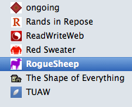
Note how there are apparent white boxes around some of the favicons — those are the ones without transparency.
Here’s a standard source list, but this time the favicons are drawn using multiply blending:
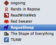
In some ways this is better. But note how the interior of ReadWriteWeb’s icon is so much less bright. Same with TUAW’s icon.
When you have an entire source list like this, not just a small detail as above, it ends up looking like it’s having a bad day but doesn’t really want to talk about it. It’s just feeling kind of blue.
Here’s what the actual shipping version looks like:
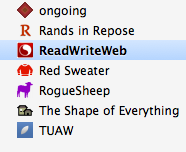
It’s drawn using multiply blending, except when the item is selected — otherwise the interior of the ReadWriteWeb’s favicon would have been the color of the selection highlight.
This solves most of the problems — you don’t get weird white boxes, and the whites don’t get dulled-down to that blue background.
But it means the source list is non-standard, and it contrasts less-well with the articles list on the right. (And so I expect to get constant feedback that the source list is non-standard.) (At one point I even considered no icons at all. I like the look. But that’s a minority taste, I’m sure. I even considered doing something very different — here was a first cut.)
Which is just to say it’s tricky. Still working on a better answer.