NetNewsWire Sync Diary #1: It Starts with NSBezierPath
In my Vesper Sync Diary I wrote about designing and writing both sides of a syncing system. I could make syncing work however I wanted it to work, and I had control of all of it.
Which is a great way to go. But it’s also terrible, because it means writing and running a server.
With NetNewsWire, I’m lucky in that there are existing systems — such as Feedbin, Feedly, Newsblur, and others — to use. I only have to write the client side.
I’m starting with Feedbin as the first syncing system. The first one is the hardest, of course — since there are a bunch of things the app needs for syncing that can be written once, but that do still need to be written.
How syncing will work
Users will add accounts to NetNewsWire — much as you do in Mail. Each account will have its own section in the sidebar (again, like Mail), which means you could have an On My Mac and a Feedbin account both active at the same time. (Just like you might have work and home email accounts active at the same time in Mail.)
You could even have multiple On My Mac and multiple Feedbin accounts. And, later, accounts with other systems.
When you make a change to the structure of your feeds and folders, the app will communicate immediately with the syncing system to perform the appropriate action. When you make a change to the metadata of an article (such as read/unread/starred status), the action will be coalesced and periodically (though fairly quickly) sent with other actions to the syncing system.
NSBezierPath
So I got started working on this, and almost immediately I found myself doing some custom drawing using NSBezierPath (which is a thing you use to fill and stroke lines, rectangles, circles, and other shapes).
Which sounds crazy, right? NetNewsWire has almost no custom drawing — in fact, before this, the only custom drawing was for the unread indicator (a circle).
And — bigger point — what does drawing have to do with syncing, anyway?
Well. There’s UI. Of course there’s UI — there’s always UI.
Users need to be able to add and edit their sync accounts, and I decided to do it the same way (surprise!) as in Mail — because this way the UI will be familiar to people who use Mail, which is surely a lot of Mac users.
I added a preferences pane called Accounts, and it uses the system-supplied icon for this exact case, and it has a thing like this on the left side…
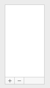
…or…
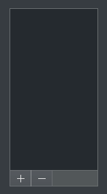
Looks much like Mail, right? (Not exactly the same, but it’s not important to make it exactly the same.)
The big space on top is a standard NSTableView, and the two buttons underneath are standard gradient buttons.
But what about that bordered gray thing to the right of the buttons? It has a background color and a border on top, right, and bottom edges — but not on the left edge, because that border belongs to the button.
There are a bunch of different ways I could have composed this whole thing, but in the end I just made that a custom view — AccountsControlsBackgroundView.swift — that draws its background and draws those three lines as a border.
(There’s probably an even simpler way using just one NSBezierPath instead of three. Or even a few NSBoxes used as lines. Whatever.)
My point isn’t that there’s anything interesting about this drawing — it’s that, when you go to work on a feature like syncing, the actual meat of the feature (communicating with sync servers) is often very small and easy.
User interface — design and implementation — tends to take up the bulk of the time, by far. By an amount that would surely surprise the heck out of people who don’t make apps.
In other words, it should never be surprising that work on a feature like syncing starts with an NSBezierPath.
Next step
What you see in the screenshots above is as far as I’ve gotten so far. The table view is empty; the buttons aren’t hooked up to anything.
The next step is to make that table view show a list of accounts, which, at the moment, is just the default On My Mac account. It should show the name and type of the account, along with an icon which represents the fact that it’s local-only and not synced.