MarsEdit user interface notes
Since MarsEdit is new, you might be curious about the thinking behind it.
Here’s the story...
But first, some background
My history with weblog editors goes back a few years. I helped write what may have been the first external weblog editor: UserLand Pike, a precursor to Radio UserLand. It was unveiled at a conference for Manila users back in early 2000.
I’m not sure if it pre-dated the Blogger API, but it used Manila’s own XML-RPC API, and it was fairly sophisticated: you could edit weblog entries but also other pages and templates and so on. It used multiple windows: each document opened in a separate window.
Unlike Radio, Pike didn’t create weblogs: it was an external editor for Manila.
Which is to say I’ve been writing and using external weblog editors for going on five years now. (My own weblogs don’t even have a browser-based UI.)
And the same themes that existed then exist now.
Why can’t it be like email?
Back when we were working on Pike—and later, too—one refrain kept coming up: weblog writing should be like writing email. Type cmd-N, get a new window, write something, click the send button.
By the year 2000 people were comfortable writing email. You could even tell in the writing: people wrote email better than they wrote for their weblog. (Not everybody, not all the time, but in general.)
Their email was often relaxed and clear in a way that their weblog writing wasn’t. Maybe it’s something about writing for the public—but I’m not sure about that since people sent well-written email to public mailing lists.
So perhaps it was the tools. Perhaps software with an email-like feel would make it easier to write.
The idea behind MarsEdit is this: the value of having an email-like user interface is not just that it’s easy-to-learn—it’s that it helps people get into a more email-like frame of mind, where they’re more likely to be relaxed, less pressured to Write Something Good.
I can’t stress this enough. The importance of the email-like interface is that it makes weblog writing feel more like writing email.
The problem of cmd-N
Above I wrote “Type cmd-N, get a new window, write something, click the send button.” That in a nutshell was the design of MarsEdit.
But at first we still pictured it as part of NetNewsWire. The weblog editor already was part of NetNewsWire, and we didn’t really want to do the risky thing of monkeying with a product that was already so successful.
But cmd-N was a problem. In any app, cmd-N—the File > New command—should create a new instance of the most important thing you create in the app. NetNewsWire 1.x didn’t have a New command, but it seemed obvious to me that cmd-N should create a new subscription.
But if cmd-N creates a new weblog post instead, then that says that the most important new thing you create in NetNewsWire is a weblog post, which means it’s more a weblog editor than a newsreader. That would have been the wrong direction.
We kept thinking about it. NetNewsWire should have a File menu that’s all about subscriptions, since that’s what you manage in a newsreader.
But a weblog editor that’s going to use an email-like interface needs a File menu that’s all about managing weblog posts.
The more we thought about it, the more it was obvious that the weblog editor had to be a separate application. In order to improve both NetNewsWire and the weblog editor, we needed to induce mitosis.
Initial design
I did the initial design work—actually sitting down with Interface Builder and laying out the app—almost a year ago, on the second floor of the Westin Santa Clara, during idle moments at the OS X Conference. (If you look over my shoulder this year, who knows what you might see!)

(In case you haven’t used MarsEdit, click the screen shot to see its main window and document windows.)
The initial design used a three-pane interface closer to NetNewsWire. Later we switched to using a drawer for the weblogs list—but the principle is the same. We mapped weblogs to mailboxes and weblog posts to emails. Obviously, the mapping isn’t perfect—weblog editing is not exactly the same as email (nor is RSS/Atom exactly the same as email)—but it was close enough to make this interface possible.
The document windows were also designed then—and they were designed to look like compose-email windows in Mail.app.
One of the significant changes between the initial design and the final design was how previews were done. Originally the preview appeared in a drawer at the bottom of each document window. (Mail doesn’t have a preview. That’s just one of many little things that are not the same. Email apps don’t need a preview.)
We switched away from the in-drawer preview mainly because—for most people—being able to resize the preview independently of the editing window was important. (We also considered doing the preview as a splitview, but that still had the problem of not being able to resize completely independently.)
The one thing I liked about the in-drawer preview was that it linked together the document and the preview, and using a separate window gets rid of that link. (That right there is a classic example of a trade-off.)
December
By December I was actually using MarsEdit to write for my weblogs. The basics were done. A very small amount of code from NetNewsWire was retained, some of the most low-level plumbing code, but even that was re-architected and simplified.
January: ecto released
When Kung-Log was rewritten as ecto—which was released last January, if I recall correctly—I checked to see if ecto was doing an email-like interface with multiple windows. It wasn’t.
But now it is! Which I take as further confirmation that the email-like interface is the right direction. I also learned that Phil Ulrich was making Userspace a multiple-document app. So it sounds like we were thinking on parallel lines.
External editor interface
MarsEdit didn’t go into testing until closer to the summer. The first release to testers was the first real test of whether mitosis was the right thing to do and whether or not MarsEdit was, well, likable. (A big yes on both counts. Whew!)
We had already planned to do an external-weblog-editor interface for NetNewsWire (long before we came up with MarsEdit), and we realized this should happen along with the shipment of MarsEdit, so it’s clear that people have choices. (To make it so that NetNewsWire could only use MarsEdit sounded like a Microsoft thing to do. Yuck. Since Sheila and I run our own business, we can actually have morals and ideals if we want to.)
The big UI challenge
I’ve said before that weblog editing is like email, but that it doesn’t match exactly. It’s actually much more complicated than email.
So we had a principle: keep it as simple as possible, but still support the features people need.
In email, for any given message, you have the following options:
To
CC
BCC
Signature
Attachments
Subject
Body (the actual message)
In a weblog post, you have some combination of the following:
Weblog
Title
URL
Body
Extended entry
Excerpt entry
Keywords
Main category
Multiple categories
Trackbacks to send
Whether or not to accept trackbacks
Text formatting
Whether or not to accept comments
Whether or not to post to the home page
That’s, well, more. Not only that, but some of the things are relatively large. Categories requires some way to display a list and select items. URL, extended, excerpt, and keywords entries mean more text fields. You have to be able to enter trackback URLs somewhere. Etc.
It’s not nearly as simple as email. Our ideal was still “Type cmd-N, get a new window, write something, click the send button”—but we had to support all these features too.
I looked around at other document-based apps that have such a huge number of different options to set with each document. I couldn’t find any. They may exist, but I don’t know what they are. Whether other such apps exist or not, weblog editing is an extreme case.
Morphing
Part one of the solution was morphing: a document window should change what options it presents based on the type of weblog you’re posting to.
For instance, if you’re writing for a Radio weblog, you don’t see options for extended, excerpt, and keyword entries. If you’re writing for a Blogger weblog you don’t see Radio’s post-to-home-page checkbox. If you’re writing for a TypePad weblog you don’t get a URL field.
I’m not normally a fan of morphing. I like interfaces that stand still and don’t do weird, automatic things. But in this case morphing was totally the way to go. (It was also one of the first things I coded in MarsEdit, and it just plain felt right.)
You can see it in action if you have several different types of weblogs you post to. Open a document window, then choose different weblogs from the weblogs popup menu. (If you go from a Movable Type to a Blogger to a Radio to a Blosxom weblog you’ll see the morphing in action. Note the animation: that was a key to making it feel right.)
This allowed us to do something important: the interface could exactly match your weblog choice. It wouldn’t be more complex than it needs to be. With so many potential options, it had to be done: just disabling things wouldn’t have done the trick. (And it’s one my favorite features, by the way.)
The extreme case
But, even with morphing, there was still the extreme case: Movable-Type-compatible weblogs.
They use almost all the options in the list farther up—they’re complex systems. (I don’t mean that in a bad way. People love Movable Type, TypePad, and WordPress, quite rightly. I just mean that the user interface was a challenge because there are so many options.)
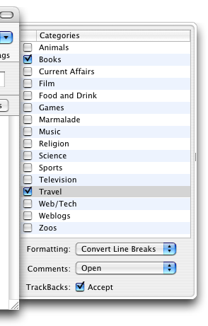
The first thing to handle was categories. The obvious thing to do was what we’d done in NetNewsWire: put them in a drawer. It was also obvious that we could put the little options (text formatting, accept comments, accept trackbacks) in the drawer too.
That left trackback URLs—and the biggie: extended, excerpt, and keywords entries.
Tracbacks
We couldn’t fit trackbacks into the document window, not without cluttering it up too much.
And, since this is a feature not everyone uses all the time, it was okay if it was slightly less accessible than categories. So we created a separate window and added a trackbacks icon to the toolbar to open it. We made the trackbacks editor modal. Which may seem like an odd choice. I don’t generally like modal windows, but setting trackbacks seems like something most people do modally anyway, so it fits.
Extended, excerpt, keywords
A new feature in Panther helped us out here: segmented views, those little capsule-like things you click to change the view.
We put those in the same place Mail.app puts the signature popup. Does it map? No, not the way the weblogs popup maps to the account popup in Mail. But there was space there, so we went with it.
We could have used a real tab view, but that felt too heavy to me when I tried it.
This, as much as morphing, was a key to MarsEdit’s design. (The way we had done it in NetNewsWire 1.x—a separate window with the various fields—bit.)
Most of MarsEdit’s pre-beta testers liked this solution. (Especially when I added the ability to set different background and text colors for the different fields.) But one tester suggested that mimicking the browser-based UI was the right thing to do here—we could have made the separate fields all visible at once.
Arguments for mimicking the browser-based UI:
1. It’s what people are used to, so there’s a familiarity thing that would be good.
2. It allows you to see what you’ve typed in one field while you’re typing in another.
Arguments against:
1. It removes the entire this-is-email feel. You’re writing in a form rather than in an email-like document window—and the email-like-feel is the core philosophy behind the app.
2. It means too many widgets, and we’re going for maximum elegance.
3. It gives you less room for writing. In fact, on smaller displays, you would have little, tiny fields to write in.
We made the call to stick with the segmented view instead of having all fields visible at once.
Keeping it simple
We also worked hard to keep menus and other things as simple as they could be made. Note that the menu bar is fairly narrow (compared to Safari or NetNewsWire) and the menus aren’t very long.
Part of this is just good UI practices—less is more—and part of it is because weblog editing is already surprisingly complex and we needed to balance that out.
But there was another reason behind it: many people using MarsEdit will be using a desktop weblog editor for the first time.
Options create anxiety. When people are trying something new it’s extra-important to remember this, because there’s already a built-in level of anxiety when trying something new.
If MarsEdit seems like a small, non-intimidating app then it means we’ve done our job.
Not just us but our testers too—who often pointed out where we could cut redundant widgets and menu commands to the benefit of the app. (Our testers are totally key. To say that this was a collaborative process would be to understate their contribution. Check out the About box.)
“...and, in conclusion...”
This is a hugely long post, so I’m going to conclude by just thanking you for reading it. Thanks!
P.S.
![]()
Not mentioned above is Bryan Bell’s contribution. His icons play a big role in the feel of the app.
My favorite may be the trackbacks icon. I had no idea what he’d come up with—and I was happily stunned when I saw it. Radar! With a document in the middle! Very clever.